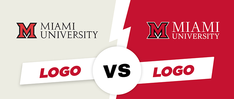
Okay, okay… “old” and “new” probably aren’t the best descriptors. Let’s go with “outdated” and “current,” since our current logo is over five years old at this point.
So, what exactly is our current logo? How is it different from the outdated version? After all, both say “Miami University,” and both feature red beveled M’s. Why does it matter? And how can you tell them apart?
Wonder no more–all of your burning logo questions are answered below.
Our Current Logo
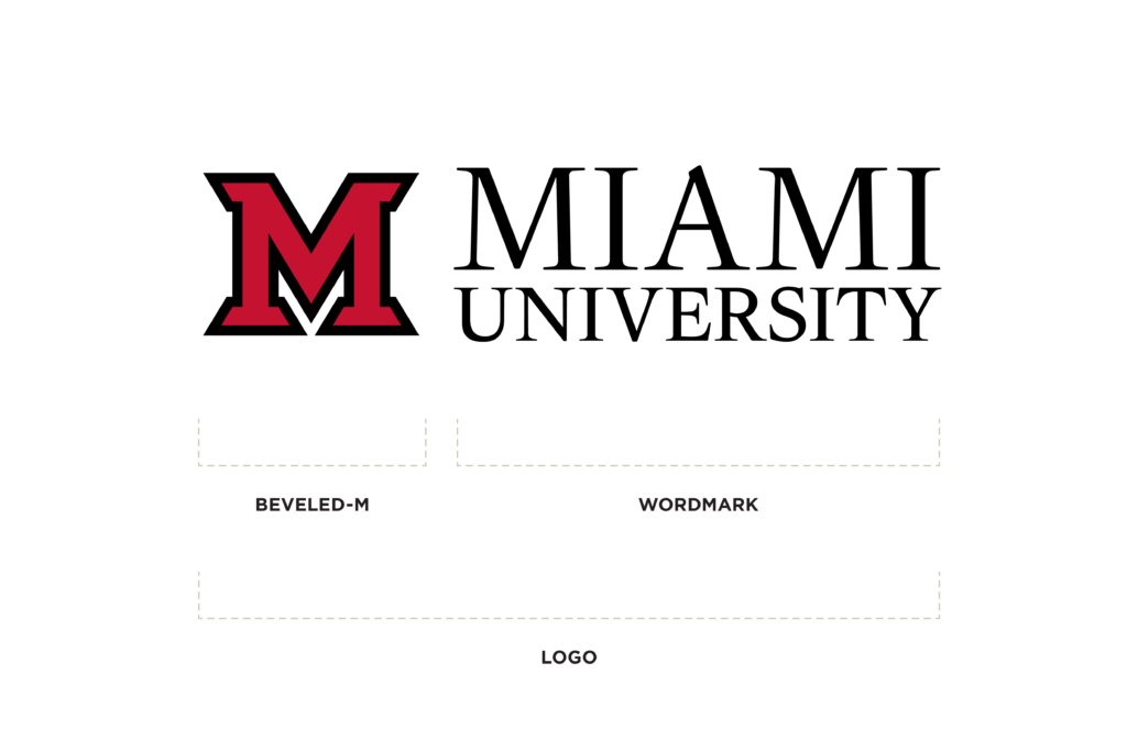
Miami’s current logo was introduced in 2021 and includes several refinements from the previous version. It is cleaner and more modern while still maintaining our classic look. The logo is available in several formats, including primary, secondary, location-based, and wordmark versions. You can learn more about these variations in the Brand Standards.
What’s the difference between the “outdated” and “current” logos?
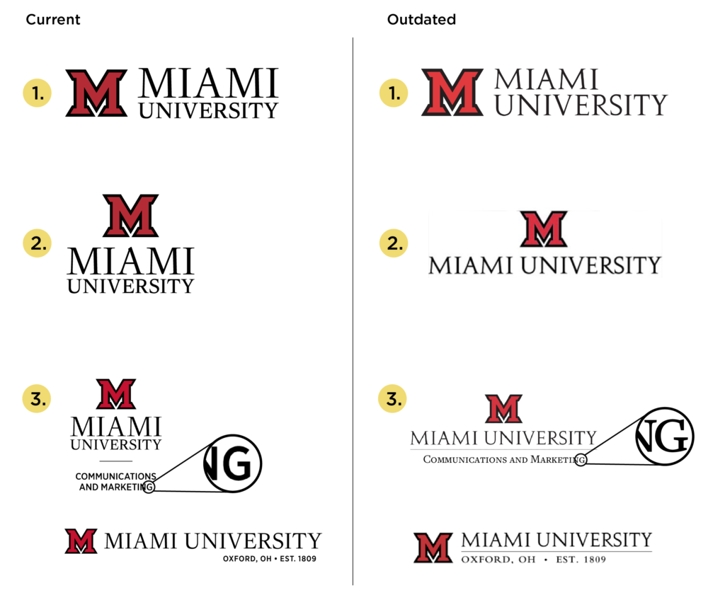
There are, surprisingly, many differences between the outdated and current logos. For brevity, we’ll highlight a few key distinctions to help you easily tell them apart (see graphic below).
- The words “Miami” and “University” are the same length in the current logo. In outdated logos, “University” is longer than “Miami.”
- In the current logo, “Miami University” is stacked. Outdated logos typically display the words side by side. (One exception is the horizontal logo.) If you’re unsure whether a wordmark is current or outdated, UCM recommends using the stacked version. You can also contact [email protected] to confirm you have the current logo.
- Additional text in the current logo uses a sans serif font, and the separating line does not extend the full length of the text. Lockups and the “Oxford, Ohio” version use Gotham Narrow for any text other than “Miami University.” Outdated logos use a serif font and a line that runs the full length of the text.
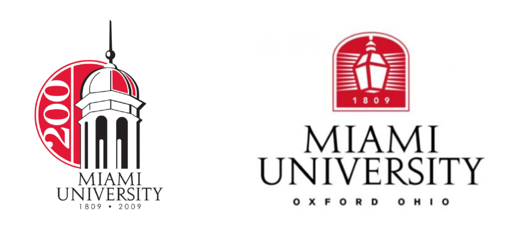
Any logo using the “lantern” or “cupola” is outdated (pictured below). These logos were in use during the bicentennial and have been discontinued for some time.
Be sure to archive any outdated logos that you may have saved on your computer, Google Drive, or Canva.
Why is using a current logo important?
It’s close enough… right? Isn’t that good enough?
Not quite.
Brand recognition depends on consistency. Logos must be used consistently so audiences can recognize and recall them. Inconsistent usage creates confusion, while consistency builds trust and credibility. Trust is one of the most important factors when someone is making a decision—especially one as significant as choosing where to spend the next four years of their life.
When a brand appears in many different forms, it can weaken credibility and leave prospective students and their families uncertain about the quality of the institution.
There’s already plenty of confusion between Miami University and the University of Miami—we don’t want to add to it. Using current logos and following Brand Standards helps distinguish us from the “other” Miami. Consistent branding strengthens our national presence and encourages students to choose our beautiful campus in Ohio … not Florida.
Our Brand Standards are the quickest and easiest reference for logo usage, including how (and how not) to use them. UCM is always happy to help clarify any questions—just reach out to [email protected].