Top Skills For Success In Any Role

I was given an opportunity to attend a leadership conference one year.  I was pretty early in my career, maybe five or so years in, and had just started managing a team.  One question they asked attendees really stuck with me: “Do your people know what you expect of them?”  We all answered, “Yes, they have goals and objectives for the year.” That’s not what the facilitators meant.  “No, does your team know, day in and day out, what you expect them to bring to work every day?” This got me thinking about success not just as ticking off the boxes on your to-do list or in your end of year objectives, but more about the way we show up every day to do our jobs. I put a list together of all the most successful people I knew – this list consisted of senior leaders, but also my peers. I listed out traits about each of them that embodied who they were, both professionally and personally (if I knew them in that regard). Given I’m an analyst in heart and mind, I started clustering these traits together. Every time I was asked in an interview by an interviewee “What makes someone successful in this role?” I come back to this list.  Truth be told, this list isn’t just for analyst or data scientist; I believe anyone who shows up each and every day and works in this way will be a success.

1. Be passionately curious

What a cliché, right?  But, Albert Einstein even said it: “I have no special talent. I am only passionately curious.” The thing is, the people who LOVE what they do, I mean genuinely get excited about everything that comes across their desk, will be seen as a true team player.  Sure, not all projects you are given will invoke pure passion, but if you decide to make the most of all projects, if you recognize there is something to learn from every opportunity you are given, then you will show up passionately each and every time.  And that curiosity? When you are passionate about your work you are more interested in digging in deeper, in uncovering those “ah-ha” nuggets. Those who show pure passion and a sense of curiosity are the best types of people to work with.

2. Be honest

I know I’m tough. I expect a lot; I’ve been told I push people harder than they are used to being pushed. I always tell my team I need to know their breaking point, not because I want them to break. We want to always be pushing ourselves to just before our breaking points, and then pull back, push again…and I bet you start to notice your breaking point moves. You get stronger and can handle more as your skillset grows.  I expect honesty so that I know when you are close to your breaking point. I once had a direct report break down on me – they were overloaded and couldn’t take on more work, admitting they had felt this way for a few weeks. I had been asking them for more because they kept saying “YES”. We sat together and prioritized their work and calendar; we got the workload to a manageable amount. This person grew from this experience. And when they left my team for another said, “I don’t know that anyone will push me the way you did. I’m better because of it.”

3.Be respectful

We know our world and the challenges we are faced with. We rarely know all the issues our peers and colleagues are facing in their day to day jobs (nevertheless their personal life). Someone else’s job may seem easy to you, or unnecessary even. I once said I didn’t understand the role of the client service group, the sales team. It’s not that I didn’t see the sales they brought in, it just did not seem “that hard” to me. BOY was I wrong. I spent some time in a more consultative role once and, while I could hang, I hated it. I tell you this story because it taught me the importance of valuing all roles on a project and team. There are parts I do not wish to play; I am thankful every day there are people who love sales because without them, what projects would I have had to analyze?

4. Challenge the data and others (but do it respectfully)

We live in a data rich world – data is streaming in from all angles. Not all data is perfect.  When something seems off, when your gut is telling you the data is wrong, chances are your gut is right. Pressure test the data and insights, making sure they measure up to benchmarks or your overall knowledge of the data. Challenge yourself, too. Ask yourself if you’ve done all you can do to deliver a top-quality product. Challenge your colleagues and peers – it is our job to ensure quality work is delivered to the end user/client, which means we need to help one another pressure test the work. I also encourage my team to challenge me – if there is a better way to do something than I am proposing, challenge me to think differently. Loop back to point #3, though, and be sure you are respecting the opinions and ideas of others.

5. Take accountability

I think about this in two ways (a) when you are assigned to work, take ownership and see it through, and (b) when you make a mistake, fess up to it right away. I’ve worked with people above me who quit putting effort into work they weren’t interested in and it sent a message to the team: if you don’t like a project, it’s ok to phone it in.  I’m here to say that is not true. That project is important to someone else – they are expecting your best effort.  When a mistake happens, I encourage people to let me know.  It’s rarely as big of a deal as they feel it is in the moment, but I promise I will always have their back and will take the fall so long as I know they are behind the scenes cleaning things up. 

What often amazes analysts and data scientists when I share this list is that there isn’t a single technical skill listed.  Those skills can be taught – these softer skills are harder to teach, are often innate in us.  They require time from our own selves to develop and nurture.  I encourage you to analyze the way you work – are you lacking in any of these areas?  Can you come up with ways to strengthen these skills?  Feel free to reach out if you are interested in discussing further – I’m always happy to help.

About the Author


Sandy Steiger is the Director of The Center for Analytics & Data Science (CADS) at Miami University. Sandy earned her Masters degree at Miami in statistics after graduating with a Bachelor’s from Mount St. Joseph University in mathematics and business. She worked in industry for fifteen years, most recently as the Vice President of Insights at 84.51 before joining CADS in April 2019.

Revamping linear regression in “big data” — A split and resample approach for predictive modeling

This blog post has been written by Dr. Jing Zhang, adopted from research she presented with Dr. Thomas Fisher and Qi He, Miami University masters student.

Linear regression is likely to be the first statistical modeling tool that many of you learn in your coursework, no matter you are a data science and statistics major, math and stat major, analytics co-major or data analytics major. It is still a popular modeling tool because it is easy to implement mathematically/computationally, and the model findings are intuitive to interpret. However, it also suffers from the lack of flexibility due to all the important model assumptions that are possibly problematic in real analysis: normality of responses, independence among observations, linear relation between the response and group of predictors. When outliers exists in the data, or the predictors are highly correlated with each other, the model findings will be distorted and therefore misleading in decision-making. What’s more, it suffers more in the “big-data” era.

A real “BIG” data set would be too big to hold in a single computer’s memory, while a “big” data simply mean that the data set is so big that the traditional statistical analysis tools, such as the linear regression model, would be too time consuming to implement, and suffers more from the rounding errors in computation.

Big data sets often have many variables, i.e. a lot of predictors in the linear regression model (i.e., large “p”), in addition to the large number of data observations (i.e., large “n”). Therefore, we need to select the “true” signals among lots “noises” when fitting any statistical models to such a data set, in another word, we often need to conduct “variable selection.” We wish to speed up the model fitting, variable selection and prediction in analysis of big data sets, yet with relatively simple modeling tools, such as linear regression.

Popular choices involves subsampling the big data and focusing on the analysis of the subset of information. For example, bags of little bootstraps (Kleiner et al. 2014) suggested selecting a random sample of the data and then using bootstrap on the selected sample to recover the original size of the data in the following analysis, which would effectively reduce the memory required in the data storage and analysis, and help in the “BIG” data case.

In addition to random selection, researchers also suggested using sampling weights based on the features of data observation, such as the leverage values (Ma and Sun, 2014) to retain the feature of the data set as much as we can when the subsampling has to be done.

Alternatively, the “divide and conquer” idea has also been popular:  big data are split into multiple blocks of smaller sample size without overlap and the analysis results of each block are then aggregated to obtain the final estimated model and predictions (Chen and Xie, 2014). This idea utilizes all the information in the data sets. In a CADS funded project, we explore the revamping of linear regression in big data predictive modeling using a similar “divide and resample” idea, via a two-stage algorithm. Firstly, we combine the least absolute shrinkage and selection operator (LASSO) (Tibshirani, 1996), which helps select the relevant features; and the divide and conquer approach, which helps deal with the large sample size, in the variable selection stage, with products being the selected relevant features in the big data with high dimension. Secondly, in the prediction stage, with the selected features, when the data are of extremely high sample size, we subsample the data multiple times, refit the model with selected features to each subsample, and then aggregate the predictions based on the analysis of each subsample. When the data are sizable but the chosen model can still be fitted with reasonable computing cost, predictions are obtained directly by refitting the model with selected features to the complete data. Here is the detailed description of the algorithm:

Step 1. Partition a large data set of sample size  into  blocks, each with sample size . The samples are randomly assigned to these blocks.

Step 2. Conduct variable selection with LASSO in each block individually.

Step 3. Use “majority voting” to select the variables, i.e, if we have a “majority” of blocks end up selecting a predictor variable in the analysis, this predictor is retained.

Step 4. When “” is large but still can be handled as one piece, refit the model with selected variables to the original data and predict based on the parameter estimates. When “” is too large to be handled as one piece, randomly select multiple subsample from the original data and refit the model with selected variables on the subsamples, then aggregate the predictions based on the models fitted to different subsamples (e.g. mean or median of the predicted values).

Simulation studies are often used to evaluate the performance of statistical models, methods and algorithms. In a simulation study, we are able to simulate “plausible” data from a known probabilistic framework with pre-picked values of model parameters. Then the proposed statistical analysis method would be implemented to fit the simulated data, and the analysis findings, such as the estimated parameters, predicted responses of a holdout set, would be compared with the true values we know in the simulation. When many such plausible data sets are simulated and analyzed, we are able to empirically evaluate the performance of the proposed methods through the discrepancy between the model findings and true values. In this project, we conducted a simulation study to help make important decisions on key components of the proposed algorithm, including the number of blocks we divide the complete data into, and how to decide “majority” in the variable selection step. This simulation study was also designed such that we are able to evaluate the impact of multicolinearity (highly correlated predictors) and effect size (strength of the linear relation between response and predictors) on the performance of the proposed algorithm in variable selection and prediction.

We simulated responses from 11,000 independent data observations total from a normal population, with a common variance of 2, among which 10,000 observations are chosen as the training set and the remaining 1,000 observations are used as the test set. For each of the 11,000 data observations, a vector of 500 predictors are simulated from normal population with mean 0, and a covariance matrix, . Two different setup of  were used, with the first one being a diagonal identity matrix, indicating a “perfect” scenario with complete independence among the predictors; and a second one being a matrix whose entry in row  and column  is determined by , mimicking a “practical” scenario where the nearby predictors are highly correlated (AR(0.9) correlation structure). Among the 500 predictors, 100 are randomly chosen to be the “true” signals and three different sets of true regression coefficients (i.e. the effect size) are chosen as follows to evaluate the ability of our proposed two-stage algorithm in terms of capturing the “true” signals when the signals are stronger (i.e., larger effect size) vs. weaker (i.e., smaller effect size). The remaining 400 predictors are all associated with zero regression coefficients in the “true” model that generates the data.

  1. all 100 regression coefficients are equal to 2;
  2. all 100 regression coefficients are equal to 0.75;
  3. 50% of regression coefficients are randomly chosen to be 0.75 and the rest are set to be 2.

 Let’s summarize what we wish to do with this simulation study:

  • How many block should we divide the 10,000 training set observations into? (4 blocks of 2,500 observation each? 5 blocks? 8,10, 16, 20 or 25 blocks?)
  • What is a good threshold for “majority voting?” Analyses of % of the blocks suggest selecting a variable. %= 50%? 60%? …100%?)
  • How does the effect size impact the variable selection and prediction?
  • How does multicolinearity impact the variable selection and prediction?

To compare the performance of the proposed method under different setups, we evaluated the following quantities: 

  • Sensitivity (proportion of the “true signals” picked up by the method, i.e. how many out of the 100 predictors impacting the mean of response are selected) and specificity (proportions of the 400 “non-signal” predictors not selected by the method) of variable selection
  • Mean squared predictor error (MSPE) of the test set.

Here are four graphs that help us visualize the simulation study findings on the determination of “majority” when different number of blocks are used. 

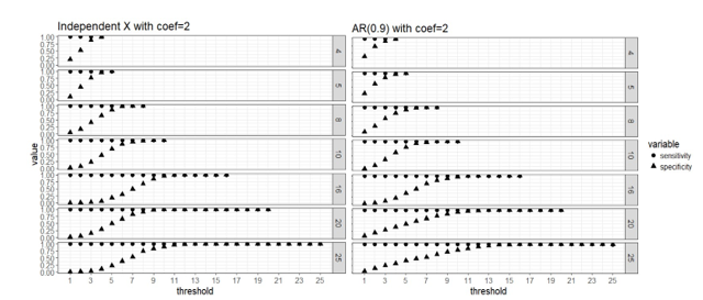
Figure 1. Strong signal scenario (regression coefficients are all equal to 2): sensitivity and specificity of the two-stage algorithm when training set are divided into  blocks respectively, and a variable is selected when  out of  blocks selects this predictor, where  =4, 5, 8, 10, 16, 20 and 25, = . Both the case with complete independence among predictors (left panel) and correlated predictors (right panel) are presented.

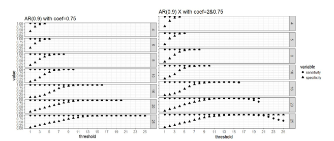
Figure 2. Weak signal scenario (regression coefficients are all equal to 0.75, left panel) and mixed signal scenario (regression coefficients are 0.75 or 2, right panel) with correlated predictors: sensitivity and specificity of the two-stage algorithm when training set are divided into  blocks respectively, and a variable is selected when  out of  blocks selects this predictor, where  =4, 5, 8, 10, 16, 20 and 25, = .

Apparently that when parallel computing is possible, it is computationally cheaper to divide the data into more blocks as there are less observations in each block and the computation speed is restricted by the computing cost of fitting the model to each block. Our simulation study did not use a real “BIG” sample size, so the computing time for each block is not high even when we use as low as 4 block. But in practice it is possible that we have giant training data and need to lower the computing cost of fitting a linear regression to a single block because the blocks still have large samples. All the number of blocks we considered here seem to approach the same level of sensitivity and specificity in variable selection, and it seems that 50% or higher blocks agreeing on the selection of variables is a good threshold for “majority voting.”

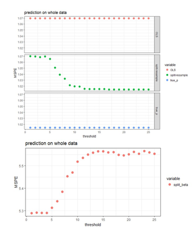
Four approaches are compared for the case of using 25 blocks on the data with independent predictors when the effect sizes are 2 (strong signal scenario).  

  1. OLS: fit OLS with all 500 predictors to the original  
  2. Split-resample: fit OLS with selected variables in the proposed approach to the original data
  3. True p: fit OLS with the 100 “true signals” to the original data 
  4. Split-resample: predict with aggregated estimation function in Chen and Xie (2014)

Comparison of the prediction performance can be visualized in the following figures:

Figure 3: MSPE computed by refitting the model with selected variables to the original data and predict for the hold out test set.

The aggregated predictions result in much higher MSPE compared to the other three approaches, so it is shown in the lower panel of Figure 3, while the other three approaches are shown in the upper panel of Figure 3. The proposed approaches produces MSPE that approaches the best scenario when we know exactly which subset of the predictors are “true signals” in the simulated data when majority voting is used assuming 50% or higher proportion of blocks is the threshold of selecting predictors. It seems that the proposed algorithm works well in variable selection when the predictors are independent or correlated; and also predicts well when 50% or higher proportion of blocks is the threshold of selecting predictors. The smaller the effect size, the more blocks need to agree on variable selection in order to achieve the same sensitivity and specificity, but this 50% or higher threshold seem to work for both strong and weak signal case in general.

About the Author


Dr. Jing Zhang is an Associate Professor in the Department of Statistics at Miami University.

Lessons from Heathrow Airport’s Data-Informed Customer Service Strategy

A while ago, before international travel was restricted due to the global pandemic, I made my way to London Heathrow International Airport to catch a flight back home after a business trip. To cater for what I expected was going to be a long wait at the security check, I arrived at the airport well ahead of the recommended time. Heathrow Airport, after all, is reputed to be one of the world’s busiest airports in terms of passenger traffic. I wasn’t taking any chances.

Instead of the dread I expected, I was pleasantly surprised. The process was quick and smooth. It took much less time than I had anticipated. To boot, the security officers were very courteous and helpful. I wondered if I was just lucky to have arrived at a slow time.

After some inquiry, I concluded that my experience could most likely be attributed to a data-informed customer feedback system that Heathrow airport had implemented to improve service delivery. Let me explain.

The Smiley Face Terminal

While en route to the departure lounge to wait for my flight, I absentmindedly pressed one of the smiley face buttons on a terminal indicating how I felt to the question, “How was your security experience today?” Much like one would do on a social media post. I didn’t think much of it until I arrived at the lounge and looked up at the large electronic panels to locate my departure gate.

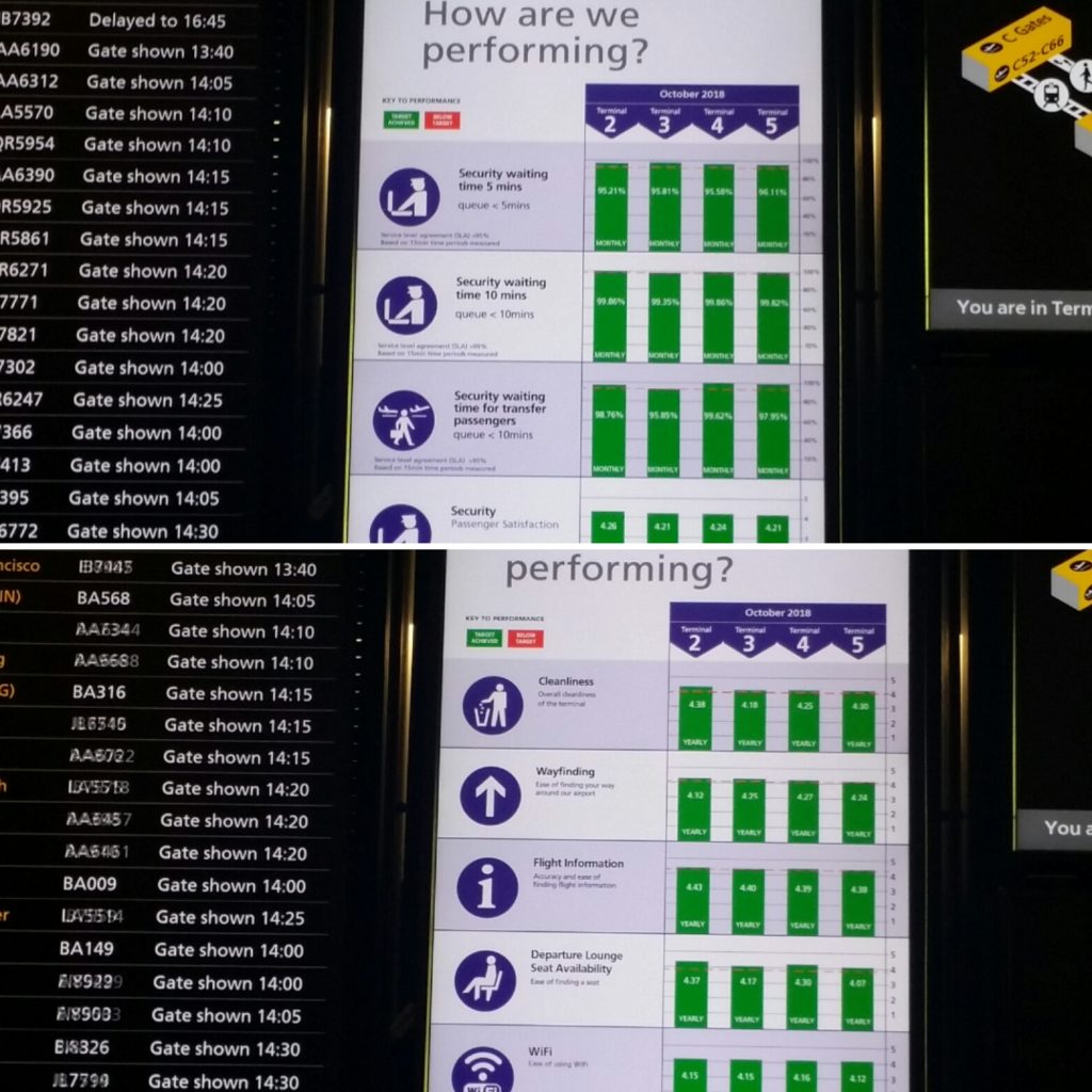
Next to lists of departing flights, each one of the electronic panels had a dashboard with bar graphs showing levels of customer satisfaction with the airport’s performance on a number of service performance targets. The bar graphs showed how each of the five terminals in Heathrow had performed in service level performance targets, such as security wait times of less than five minutes.

It was fascinating to see that all the terminals had achieved their targets 98% of the time over the month. For example, one bar graph showed that a terminal had scored 4.21 and above out of a possible high score of 5 in customer satisfaction level. I had a light bulb moment when I realized that the smiley face terminal I had just encountered was a tool for collecting feedback from travelers about their experience.

Immediately, I applied my investigative skills to find out how Heathrow came up with this tool and how it was implemented.

The HappyOrNot Innovation

An internet search of “smiley face terminal” brought up articles in the New Yorker and the Telegraph describing this innovation. I discovered that it was developed by a small Finnish startup led by a programmer called Heikki Väänänen. As the story goes, Heikki liked to give feedback to establishments he patronized, but filling out surveys was inconvenient. Apparently, he is not alone.

Heikki saw this as a business opportunity and developed the so-called “HappyOrNot” terminals. The terminals have buttons with smiley faces (made ubiquitous by social media), ranging from very happy to dissatisfied, for customers to register their level of satisfaction. They are simple to use and send data directly to people who are interested in the results.

Heathrow Airport implemented the HappyOrNot terminals to improve customer satisfaction levels ahead of the expected influx of international visitors for the 2012 Summer Olympics. They positioned HappyOrNot terminals so that passengers could use them as they cleared security. Airport executives were able identify problem locations in real time, and address the issues quickly. At the time, Heathrow security’s over-all passenger-satisfaction scores are reported to have risen by more than half.

Contrast this with the Transportation Security Administration (T.S.A.) feedback system that the New Yorker writer encountered at Palm Beach International Airport. Customers were invited to scan a QR code to inform T.S.A. of their experience. After scanning the QR code, the writer ended up with a link to T.S.A.’s general customer-service web page.

The writer then had to search for a form which required him to provide his full name and email address to create an account so he could then log in to provide feedback! Hardly the way to encourage customer feedback!

Data-Informed Decision Making

Organizational and business leaders all over the world are increasingly applying innovative ways to gather and analyze customer feedback to gain insights to improve their systems.   Management scholars have called this concept organizational learning. The term “learning organization” was made popular by Peter Senge in his book The Fifth Discipline.

One characteristic of learning organizations is that they need to be able to detect and correct errors. To do this, an organization needs to be able to seek out and seriously consider feedback about the work employees are engaged in, the wider environment, and its performance.

In the past, organizations collected and then analyzed data “off-line” in order to determine corrective actions to take. Modern technology, however, has now made it possible to learn at the very moment of action.

Heathrow Airport, for example, has a key performance index of getting travelers through security in 5 minutes or less. HappyOrNot terminals have proven to be an effective tool for the officials to collect real-time data from customers on how they are performing on this service target. Actionable insights enable airport officials to pinpoint problem areas and attend to them immediately, thus increasing their competitiveness as an air transportation hub.

Data from customer feedback is not only useful in the scenario just described involving single-loop feedback – a response that tells you you need to adjust how you’re acting. Insights from data can also generate double-loop feedback –  a response that tells you that your approach or strategy needs to change. Data are not only useful in detecting discontinuities between strategy and performance in the present, but also among possible visions, strategies, and specific goals for the future that an organization has.

Organizations that are going to be competitive in the fast-paced, interconnected and globalized world where large amounts of data and automation are the norm, are going to be organizations that are quick to learn and adapt at every level of the organization. Data-informed decision making is crucial for individuals, teams, organizations and larger institutions to become more capable of self-transformation with the result that they are more creative, more aware, more just, and more sustainable.

About the Author

Peter Maribei, PhD is the Associate Director of Education Abroad at Miami University – Oxford. He manages faculty led study away and study abroad programs. Over the course of his career, he has developed international internship and exchange programs and taught students from the Americas, Europe, and Africa. His scholarly interests lie in experiential learning strategies that contribute towards the development of moral imagination, intercultural competence and socially responsible leadership

Sports and Data Science: A Crossroads

To be completely honest, when I hear data science the first thing that comes to mind is complex data sets being manipulated by very smart people with very smart computers, which isn’t a bad thing! However, there are many other applications and uses for data science and analytics that attract different people with different interests. One of those applications that is particularly interesting to me and hopefully to you as well, is the use of analytics and data science in the sport industry. 

My name is Kade Peterson and I am a sophomore marketing major and sport management minor. I recently started working with CADS as a marketing intern this fall semester, to gain marketing experience and understand how Miami University uses data science around campus. I saw an opportunity to connect what I have been learning through CADS with my love of sports to investigate the use of data science in athletics. I had a conversation with my roommate, who works for the university’s baseball team as a student manager. He told me about the different data collection methods they have for the baseball team. As well as the processes they go through to analyze this data and present it to the rest of the organization to recommend action and show what is effective for the team. 

After having this discussion, I wanted to further investigate the use of data analytics in the sport industry in different areas of the market. I was drawn towards researching the use of sports analytics in golf because that is one of the sports I am most passionate about. One of the biggest stories of the year in the golfing community was the development of a much larger, much longer hitting Bryson DeChambeau. He has earned himself the nickname of The Mad Scientist, because of his devotion to tracking data and the mechanics of the body. Upon returning to competition after the COVID-19 pandemic, Bryson had added 30 pounds to his frame from daily workouts and strength training. He has become a much larger player which has resulted in him hitting the ball a LOT further. He is averaging 330 yards off the tee this season, which is up almost 40 yards from his previous seasons average. This massive increase has put him in first place for average driving distance on tour, nearly 10 yards ahead of his closest competitor (Source). 

Following the return to competition, there were lots of questions surrounding BeChambeau and if this change was worth it. He silenced all of those questions this year, placing in the top 10 in 9 of the 17 events he played. As well, he earned his first major title (a major is one of the 4 biggest tournaments each year U.S Open, The Open, The Masters, and PGA Championship) winning the U.S Open this year. Bryson DeChambeau is a breath of fresh air in a sport that has long been stuck in its ways and lacking diversity. He is a self-described nerd in the game of golf and has turned towards data in a game that is generally feel based. When promoting the launch of an app that helped players pick the best golf ball for themselves, Bryson said “ the data analytics aspect of golf has helped me understand, from a percentage standpoint, where to hit shots, how to play a course, what clubs to use based on conditions, etc…” (Source). Bryson has turned to data analytics to try and give himself an advantage over his competition, combined with his physical transformation he has become one of the most talked about players on tour. 

We are at a point where nearly every sport being played has some sort of data tracking and analytics aspect involved with it. The reach of data analytics in sports has increased over time. For example, The University of Connecticut just hosted a Sports Analytics Symposium with over 300 participants including students at the undergraduate and high school level. The purpose of this conference is to provide information to students who are just beginning to work with sports analytics or do not know much about it but know they are interested in sports and math. The symposium had four keynote speakers including Brian MacDonald the director of sports analytics at ESPN (Source). Universities are starting to offer more sports analytics opportunities to students. Miami University gives students the ability to gain a sports analytics certificate as well as a sports analytics minor. The crossroads of data analytics and sports has become more prominent in the sport industry and schools are moving to accommodate this industry shift.

In conclusion, the sport industry is usually not the first thing that comes to mind when discussing data analytics. However, it is a quickly growing segment in the sport industry that offers a unique use of it. This shows the wide spread of data analytics and how it impacts so many different industries in the world.

About the Author

Kade Peterson is a sophomore majoring in marketing with a minor in sport leadership and management. He also interns for the Center for Analytics and Data Science’s marketing team.

Insights from winning ASA’s DataExpo

When I was a prospective student touring colleges, I assumed research always involved test tubes and lab rats. However, as I reflect on the research project I completed this year, I am happy to say I did not spend any time in a lab. Instead, all I needed was my computer to participate in the DataExpo, a data science competition sponsored by the American Statistical Association (ASA).

Each year, students are given a government dataset and guiding questions, and then are expected to develop their own research project and present findings to judges at a statistics conference in the summer. This year, participants were asked to analyze data from the Global Historical Climatology Network, which contains weather records for the entire world since the 18th century. My project examining the relationship between public perception of climate change and county-level weather trends in the United States won first place in the competition. I learned a lot about data-driven research projects through the DataExpo and thought I would share some of my insights from the process.

  • Set boundaries to avoid becoming overwhelmed by an open-ended project.

My original idea for this project was to look at the social impact of climate change around the world. This is clearly very different from my final research question regarding public perception of climate change in the United States. Why did my research question change so drastically? It was important to narrow the scope of my analysis to something specific and manageable.

In order to analyze my original question, I would have needed to define social impact as it relates to climate change, found data that related to my definition of social impact, and then developed a method for quantifying social impact based on the data I had gathered. All of this would have been in addition to a similar process of quantifying climate change around the world with the GHCN data. As a full-time college student with about 6 months to complete the project, this was not feasible.

Rewriting my research question not only made my life easier, but it helped me create a better and more compelling story. For example, narrowing the scope of the analysis to the United States in the past 50 years was compelling from both a storytelling and data quality perspective. The United States was the best represented country in the dataset, and measurements are more accurate over the past 50 years as opposed to the past 100 years. I also knew the audience would almost entirely consist of people from the United States, and many middle-aged and older viewers would have been alive for most if not all of the period of analysis.

  • Recognize that performing analysis is a long and iterative process.

Even after I narrowed the scope of the analysis, the data processing for this project presented a significant challenge. I initially had 50 datasets (one per year), each with one row per weather station, per day. I needed to manipulate this data to get a new dataset with one row per county where the columns captured county-level temperature change over the past 50 years.  Recognizing there was a lot of work to be done, my advisor Dr. Tom Fisher and I broke the process down into a series of smaller steps. We transformed the data to get one row per station per year, and then to get one row per county per year. Finally, we measured the change in each county over time to obtain a dataset with one row per county.

A lot of this project involved thinking about the next step forward from where we were standing. Over the course of many months, we incrementally changed the dataset to obtain the final product. Some steps were repeated multiple times, and some steps were simplified or reduced to fit better with our end goal. For example, we originally processed the data for the last 120 years, and then only decided to use the last 50. Of all the summary statistics we calculated, only two of them turned out to be useful. I also reran the analysis to include precipitation measures late in the analysis process. It can be frustrating to feel like you’ve wasted your time on unused data processing or analysis, but it’s all part of the journey towards the final product.

  • Statistics is all about the story.

I think one of the most frustrating parts of any data project is that the parts of the project you dedicate the most time to are generally not what you share with the audience. Instead, the success of the project is judged based on the results of your project and how you deliver them.  After processing the climate data, I joined the final results to global warming survey data collected by Yale in 2019.  Using the full dataset, I built a series of maps and graphs to examine the relationship between observed climate change and public perception of climate change. Unfortunately, there wasn’t a strong correlation between the two sets of variables.

While my research question was answered, the end of the story just wasn’t satisfying. So rather than end the story there, I looked into several demographic factors to see if any of them were highly correlated with belief on climate change. Unsurprisingly, political ideology (represented by data from the 2016 presidential election) had the strongest correlation with belief on climate change. This extra step created a much better ending to my story. Rather than ending with a disappointing lack of correlation, I was able to construct a narrative about how Americans are more guided by political ideology and belief than empirical data, a suggestion that is especially relevant today in a world where public opinion doesn’t always align with scientific findings. 

Conclusion

I want to close with my biggest life lesson from this project, which is to always say yes to opportunities for practical experience in a field you’re passionate about. When I first joined the DataExpo team as an observer my sophomore year, I struggled to complete basic coding tasks. However, my experience shadowing that year not only led to my successes with this year’s project, but it also resulted in the opportunity to work more closely with members of the statistics faculty and students, in addition to getting me involved with CADS. I really appreciate Dr. Tom Fisher, Dr. Karsten Maurer, Matthew Snyder, Alison Tuiyott and Ben Schweitzer for making the DataExpo such a great experience. All of these opportunities have greatly improved my technical skills and prepared me for life after college. As I look back on my time at Miami, I will always be grateful for these experiences and for all of the people who helped me along the way.

About the Author

Lydia Carter is a senior at Miami University majoring in Statistics and Analytics. She has interned for CADS since Fall 2019.


Chemists and Analytics, A Surprising but Fruitful Partnership

My first experience as a CADS intern was standard to many. I worked with two other students and a faculty advisor on a project for a corporate client. The project followed a typical and expected process from introduction of the problem, lots and lots of industry research, applying analytical solutions to said problem, and then a final recommendation and presentation to the client. Once finished, I was excited and looking forward to a similar experience the following semester. However, before the semester ended, my team’s faculty advisor alluded that my skills may be put to the test next semester on a project with the chemistry department. Little did I know that this opportunity would teach me more about chemistry, analytics, data science, and the intersection of them, than I could have ever imagined.

For a little background, I am a current senior at Miami University where I am studying finance and business analytics. I was introduced to CADS and knew this was something I wanted to be involved with. It was an opportunity to use the skills and knowledge I had gained in the classroom, along with developing new ones, to fun and interesting projects. When one of my professors, Dr. Weese, mentioned she wanted me to be involved in a project for Miami University’s chemistry department, I was immediately intrigued. Never did I imagine I could apply my skills to a problem faced by my university’s chemists. That is, until our analytics team met with the chemistry team when we all realized the amount of untapped potential this partnership held. This partnership consisted of undergraduate students, graduate students, PhD candidates, professors, and even a department head from the Chemistry and Information Systems & Analytics departments at Miami University.

When you think about it, much of the typical chemist’s work is repetitive and manual. Compounds are researched, tested, and experimented with all by hand for the most part. Computers and robots can automate some of this if you have enough resources, but the point is that most every part of this process normally has to be done by hand, either a human’s or a robot’s. The advent of machine learning and artificial intelligence has already transformed many industries by eliminating, or at the minimum reducing, much of these tedious tasks. Thanks to Dr. Zishuo “Toby” Cheng and his curious mind, the question “Why can’t we apply machine learning to our beta lactamase inhibitor research?” was posed. What I loved most about this proposition is that nobody had tried anything exactly like it before. There was every reason for this partnership to work; we had the data, the smarts, and the desire, just nothing to go off of. However, this wasn’t an issue or disadvantage at all; instead, it forced us to think outside the box and think of every possible way to do something and see what worked and, many times, what didn’t. Not that having something to model after is ever bad, but it’s just human tendency to latch on to what was done before as the correct way. In our work, just about everything we did was “right”, only because there wasn’t anything to prove otherwise.

After several months being on the job, I think it is safe to say this partnership has been a huge success. By throwing numerous data science and analytical methods at the problem, we were able to dwindle down the search space of unknown compounds from over 70,000 to just 3,000. When you consider how in a normal situation every one of these 70,000 compounds would have to be tested, it becomes quickly clear how important this was feat was. No longer do you have to take a complete shot in the dark and hope you find a good compound; instead, you are able to look through only the compounds that have the highest probability of being successful per our models. Pending the results of the high throughput screening of these 3,000 compounds, we could eventually apply our analyses and models to a database of millions of unknown compounds.

It was in these times where the partnership really shined. As analytics students with no background in chemistry more advanced than high school chemistry, all of our results meant little to nothing to us. However, with our knowledge of what the numbers were showing and the chemists’ knowledge of what the numbers represented, we were able to uncover some incredible insights. For example, we strategically employed models with some form of interpretability that gave insight into what features of a compound make a good beta lactamase inhibitor. A couple of the most important variables made sense and were already well known as important features to the chemists. However, there were several features of good inhibitors according to our models that had never been considered before. The chemists determined these features still made logical sense, but simply were things not seen in past research. Although it isn’t the discovery of the next greatest beta lactamase inhibitor yet, it is insights like these that validate we are on the right track and give a glimpse in to the incredible potential for interdisciplinary teams like ours.

What’s next? For our team, we will continue to explore better methods for supporting the chemists’ research of beta lactamase inhibitors, hopefully leading to further insights into these important compounds. On a much larger scale, I hope to see many more partnerships like this one arise around Miami University. I can imagine successful partnerships with areas all over Miami. Thanks to CADS, these partnerships aren’t a matter of if they will ever happen, it’s simply a matter of when.

About the Author

Mitch Fairweather is a Miami University senior studying Finance and Business Analytics

From Miami into the workforce… and my experiences along the way

Hi! My name is Sophie Armor. I graduated from Miami in May 2020 with a B.S. in Finance with minors in business analytics and entrepreneurship. Upon graduation, I joined Fifth Third Bank as an associate data scientist in the Decision Science Group (DSG) at the bank.

My Miami Experience 

I moved to Oxford from just an hour away in Cincinnati. Both my mom and my older sister attended Miami, so I was pretty familiar and very excited to eat lots of skippers in four years. In terms of my education, I was always very into math and was drawn to studying finance but had an interest in the growing field of sports analytics that drew me to immediately declare business analytics as one of my minors. 

I started interning at CADS first semester of my junior year after taking ISA 291 with Dr. Weese. The first semester I was able to work on an experiential learning project with a bank. The purpose of the project was to perform a segmentation to identify differentiable, actionable and accessible customer segments. We were then to develop business strategies based on the insights. 

We leveraged factor analysis using the survey data to identify key questions for our analysis before clustering.  Our team had the tremendous opportunity to present out our analysis and insights to several individuals from the industry team. I would definitely say this played a big part in getting me to where I am today! After this project, I got to work on two more challenging projects with groups of amazing students that allowed me to gain valuable experience with workplace teams. 

Getting into certain classes at Miami can be hard… scheduling is stressful. There are several courses I took that I found to be extremely valuable. First off, ISA 291: Applied Regression Analysis and ISA 491: Data Mining. My current role includes conducting advanced analytics by utilizing predictive analytics, machine learning and optimization to deliver insights or develop analytical solutions to achieve business objectives. This is exactly what I learned in class and am able to apply at work. Getting the opportunity to deliver results, especially meaningful results, is crucial. I would also recommend saving code as applicable. At Miami, I primarily used R while I am now using Python – learning it as I go and spending time on DataCamp. I will say that knowing R was extremely helpful and (mostly) transferable to Python. 

My entrepreneurship classes really challenged me and made me grow as a student. ESP 252 is a class I believe everyone should take. The course is centered around leadership. Overall, the courses at Farmer paired with my three semesters as a CADS intern put me on a great path for discovering what I wanted to do with my post grad life. 

Beginning a Career in Data Science 

Like many others, I was unsure what I wanted and what life would be like after graduation. I spent the summer between junior and senior year in Chicago at W.W. Grainger in corporate finance, so not exactly the most comparable experience for my current role, but it was exactly what I needed in an internship. 

I was nervous, intimidated, excited and full of emotion as my start date got closer and closer this past July. My role as an associate data scientist is to assist in making data driven decisions (using data, statistical analysis, algorithms) throughout the bank. The projects that the Decision Science Group work on provide value and recommendations to support business growth. Am I qualified to take part in decisions that may change how the bank operates or markets to customers? I don’t know. 

As a new employee in the data science world, my days consist of working with others on my team to identify a problem with core questions to be answered, creating an analytical plan and then performing the analysis with check-ins with others throughout. The variety of projects that my team works on is very cool! I am learning each day and the Decision Science Group has a great environment for working together while getting any questions answered along the way. 

Working from home brought a new challenge as I transitioned into the working life as a new employee. I had to learn to manage my time as I work from my apartment. There is a lot of independence and a need for self-motivation. I have always put an emphasis on building relationships with those I meet and work with. This was both a challenge and opportunity in my new role as I begin to connect with people both in the Decision Science Group and other departments at the bank. 

Some Advice to Leave You With

Lastly, I want to give some advice (if anyone wants advice from a 22-year-old). 

  • Gain experience wherever you can 
  • Ask questions
  • Network!! 

Love and Honor,

Sophie Armor, Class of 2020


My COVID-19 test is positive … do I really have it?

This blog post is reproduced from ISI Statisticians React to the News blog (https://blog.isi-web.org/react). It was released on 25 August 2020

Michael DeWine, governor of the state of Ohio in the United States, provided a visible example of the  properties of screening tests.

Gov. Mike DeWine of Ohio Tests Positive, Then Negative, for Coronavirus by Sarah Mervosh, The New York Times (6 August 2020 with 7 August 2020 update).

After testing positive for COVID-19 on a rapid antigen test, he missed an opportunity to meet with the US president who was visiting DeWine’s state. After DeWine was tested again using a slower, more accurate (RT-PCR) test, he was negative for COVID-19. A additional test administered a day later also was negative.

Are there benefits in having a rapid, less accurate test as well as having a slower, more accurate test? Let’s consider what accuracy means in these tests and why you might be willing to tolerate different errors at different times. 

I won’t address how these tests are evaluating different biological endpoints. I’ve been impressed at how national and local sources have worked to explain the differences between tests that look for particular protein segments or for genetic material characteristic of the virus. Richard Harris (National Public Radio in the US) also provided a nice discussion of reliability of COVID-19 tests that might be of interest. 

I want to talk about mistakes, errors in testing. No test is perfectly accurate. Accuracy is good but accuracy can be defined in different ways, particularly in ways that reflect errors in decisions that are made. Two simple errors are commonly used when describing screening tests – saying someone has a disease when, in truth, they don’t (sorry Governor DeWine) or saying someone is disease free when, in truth, they have the disease. Governor DeWine had 3 COVID-19 tests – the first rapid test was positive, the second and third tests were negative. Thus, we assume his true health status is disease free.

These errors are called false positive and false negative errors. (For those of you who took introductory statistics class in a past life, these errors may have been labeled differently: false positive error = Type I error and false negative error = Type II error.)  Testing concepts include the complements of these errors – sensitivity is the probability a test is positive for people with the disease (1 – false negative error rate) and specificity is the probability a test is negative for disease-free people (1 – false positive rate). If error rates are low, sensitivity and specificity are high.

It is important to recognize these errors can only be made when testing distinct groups of people. A false positive error only can be made when testing disease-free people. A false negative error only can be made when testing people with the disease. An additional challenge is that the real questions people want to ask are “Do I have the disease if I test positive?” and “Am I disease free if my test is negative?” Notice these questions involve the consideration of two other groups –people who test positive and people who test negative!

Understanding the probabilities

Probability calculations can be used to understand the probability of having a disease given a positive test result — if you know the false positive error rate, the false negative error rate and the percentage of the population with the disease, along with testing status of a hypothetical population. The British Medical Journal (BMJ) provides a nice web calculator for exploring the probability that a randomly selected person from a population has the disease for different test characteristics. In addition, the app interprets the probabilities in terms of counts of individuals from a hypothetical population of 100 people classified into 4 groups based upon true disease status (disease, no disease) and screening test result (positive, negative). 

It is worth noting that these probabilities are rarely (if ever) known and can be very hard to estimate – particularly when changing.  In real life, there are serious challenges in estimating the numbers that we get fed into calculators such as this – but that’s beyond scope of this post.  Regardless, it is fun and educational to play around with the calculator to understand how things work.

These error rates vary between different test types and even for tests of the same type. One challenge that I had in writing this blog post was obtaining error rates for these different tests. Richard Harris (NPR) reported that PCR false positives from the PCR test were approximately 2%, with variation attributable to the laboratory conducting the study and the test. National Public Radio reported that one rapid COVID-19 test had a false negative error rate of approximately 15% while better tests have false negative tests less than 3%.  One complicating factor is that error rates  appear to depend on when the test is given in the course of disease.

Examples

The following examples illustrate a comparison of tests with different accuracies in communities with different disease prevalence.

Community with low rate of infection

A recent story about testing in my local paper reported 1.4% to 1.8% of donors to the American Red Cross had COVID-19. Considering a hypothetical population with 100 people, only 2 people in the population would have the disease and 98 would be disease free. 

Rapid, less accurate test:  Suppose we have a rapid test with a 10% false positive error rate (90% specificity), 15% false negative error rate (85% sensitivity) and 2% of people tested are truly positive. With these error rates, suppose both of the people with the disease test positive and 10 of the 98 disease-free people test positive. Based on this, a person with a positive test (2 + 10= 12) has about a 16% (2/12 x 100) chance of having the disease, absent any other information about exposure. 

  Disease No Disease Total  
Test + 2 10 
(98 x .10)
12 2/12
(16%)
Test –
(2 x .15)
88 89  
 Total 2 98 100  

For a hypothetical population of 100 people with 2% infected, a false positive rate of 0.10, and a false negative rate of 0.15, the chance of having the disease given a positive test is about 16%.

Slower, more accurate test: Now, suppose we have a more accurate test with a 2% false positive error rate (98% specificity) and 1% false negative error rate (99% sensitivity). With these error rates, both of the people with the disease test positive and 2 of the 98 disease-free people test positive. Based on this, a person with a positive test (2 + 2= 4) has about a 50% (2/4) chance of having the disease. 

  Disease No Disease Total  
Test + 2 2
(98 x .02)
4 2/4
(50%)
Test – 0  
(2 x .01)
96 96  
 Total 2 98 100  

For a hypothetical population of 100 people with 2% infected, a false positive rate of 0.02, and a false negative rate of 0.01, the chance of having the disease given a positive test is about 50%.

Community with a higher rate of infection

Now suppose we test in a community where 20% have the disease. Here, 20 people in the hypothetical population of 100 have the disease and 80 are disease free. This 20% was based on a different news source suggesting that 20% was one of the highest proportions of COVID-19 in a community in the US.

Rapid, less accurate test: Consider what happens we use a rapid test with a 10% false positive error rate (90% specificity) and 15% false negative error rate (85% sensitivity) in this population. With the error rates described for this test, 17 of the 20 people with disease test positive and 8 of the 80 disease-free people test positive. Based on this, a person with a positive test (17 + 8 = 25) has about a 68% (17/25) chance of having the disease without any additional information about exposure.

  Disease No Disease Total  
Test + 17 8
(80 x .10)
25 17/25
(68%)
Test –
(20 x .15) 
72 75  
 Total 20 80 100  

For a hypothetical population of 100 people with 20% infected, a false positive rate of 0.10, and a false negative rate of 0.15, the chance of having the disease given a positive test is about 68%.

Slower, more accurate test: Now suppose we apply a more accurate test with a 2% false positive error rate (98% specificity) and 1% false negative error rate (99% sensitivity) to the same population. In this case, all 20 people with the disease test positive and 2 of the 80 disease-free people test positive. Based on this, a person with a positive test (20 + 2 = 22) has about a 90% (20/22) chance of having the disease. 

  Disease No Disease Total  
Test + 20 2
(80 x .02)
22 20/22
(90%)
Test – 0
(20 x .01) 
78 78  
 Total 20 80 100  

For a hypothetical population of 100 people with 20% infected, a false positive rate of 0.02, and a false negative rate of 0.01, the chance of having the disease given a positive test is about 90%.

Returning to the big question

So, if you test positive for COVID-19, do you have it? If you live in a community with little disease and use a less accurate rapid test, then you may only have a 1 in 6 chance (16%) of having the disease (absent any additional information about exposure). If you have a more accurate test, then the same test result may be associated with a 50-50 chance of having the disease. Here, you might want to have a more accurate follow up test if you test positive on the rapid, less accurate test.  If you live in a community with more people who have the disease, both tests suggest you are more likely than not to have the disease. Recognize that these tests are being applied in situations with additional information being available including whether people exhibit COVID-19 symptoms and/or live or work in communities with others who have tested positive.

Final thoughts

You might be interested in controlling different kinds of errors with different tests. If you are screening for COVID-19, you might want to minimize false negative errors and accept potentially higher false positive error rates. A false positive error means a healthy disease-free person is quarantined and unnecessarily removed from exposing others. A false negative error means a person with disease is free to mix in the population and infect others. So, does Governor DeWine have COVID-19? Ultimately, the probability that the governor is disease-free reflects the chance of being disease-free given one positive result on a less accurate test and two negative results from more accurate tests. The probability he is disease-free is very close to one, given no other information about exposure.

About the Author

Dr. A. John Bailer is a University Distinguished Professor and Chair in the Department of Statistics at Miami University.