


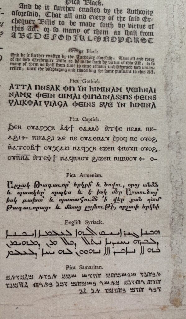
How did a typeface created by an English printer come to represent America? And what does this typeface have to do with McGuffey’s Readers?
Take a look at the the Preface to the 1837 edition of the Eclectic Third Reader, pictured above, and the detail below. The typeface is almost certainly Caslon, the most common typeface of the late 18th and early 19th century in America.

Caslon was created by William Caslon in England, but it came to represent the fledgling United States when copies of the Declaration of Independence were printed using Caslon. From that point forward, the typeface became the go-to choice for printers who wanted a modern feel, which seemed just right for a brand new country. What Helvetica brought to the 1960s, Caslon offered to printers at the turn of the 19th century.
Caslon is a typeface designed for readability. The Roman letterforms are sturdy with relatively little differentiation between thick and thin strokes. Each letter clings to its vertical axis, allowing the letters to remain distinct while still easily forming legible words. From a distance, a page of printed Caslon may appear to have darker and lighter areas, but close enough to read, it is very accessible. The small but distinct serifs carry the reader’s eye along with little effort.

In many editions of the Eclectic Readers, the publishers tout the easy-to-read typography, although Caslon is never mentioned. Readability is certainly important in a school textbook. However, it is also important that books intended for a frontier environment feel new, modern, and distinctly American.
Sources:
McNeil, Paul. The Visual History of Type. London: Laurence King Publishing, 2021.
Meggs, Philip B., and Alston W. Purvis. Meggs’ History of Graphic Design. Hoboken, N.J: John Wiley & Sons, 2016.