Precedent Study
My initial precedent for a library was the Geisel Library by William Pereira. The design itself was not used as much in my library, however taught me valuable lessons about what should not be included in my layout. The main lesson I drew from this library was to provide multiple points of entry, since the Geisel Library only had one main point of entry into the library. Not only is this not up to code today, but it puts lots of pressure on the entry sequence, and constantly has to be repaired.
Conceptual Development
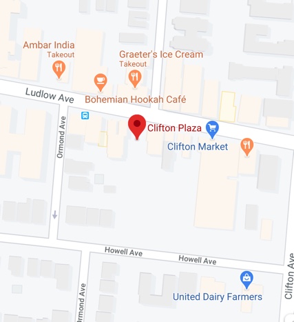
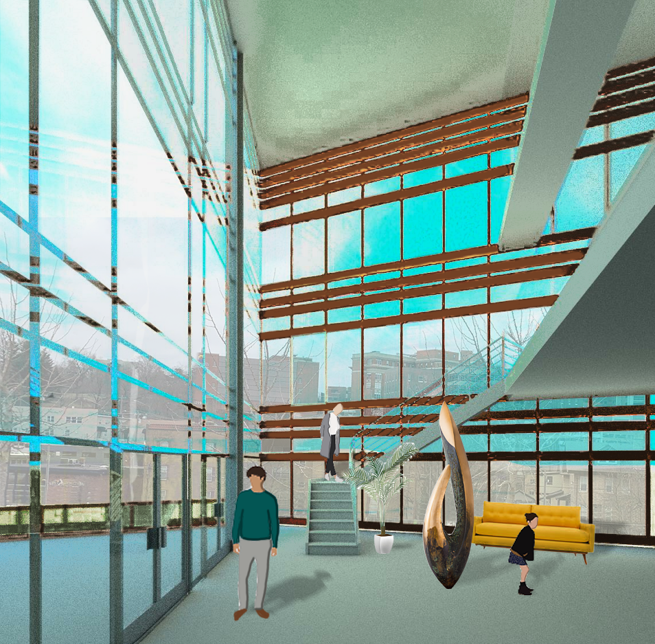
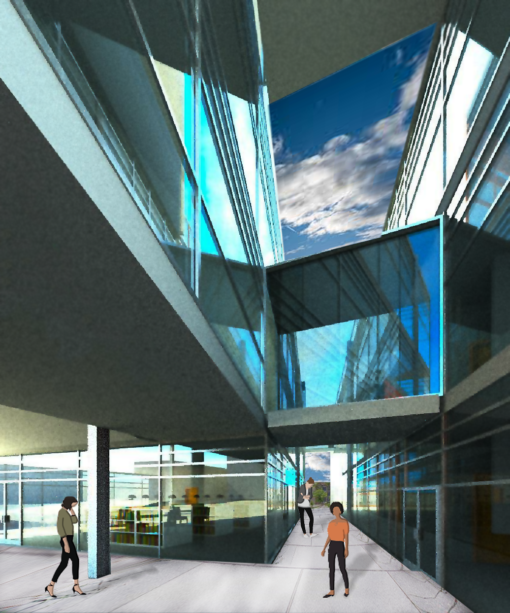
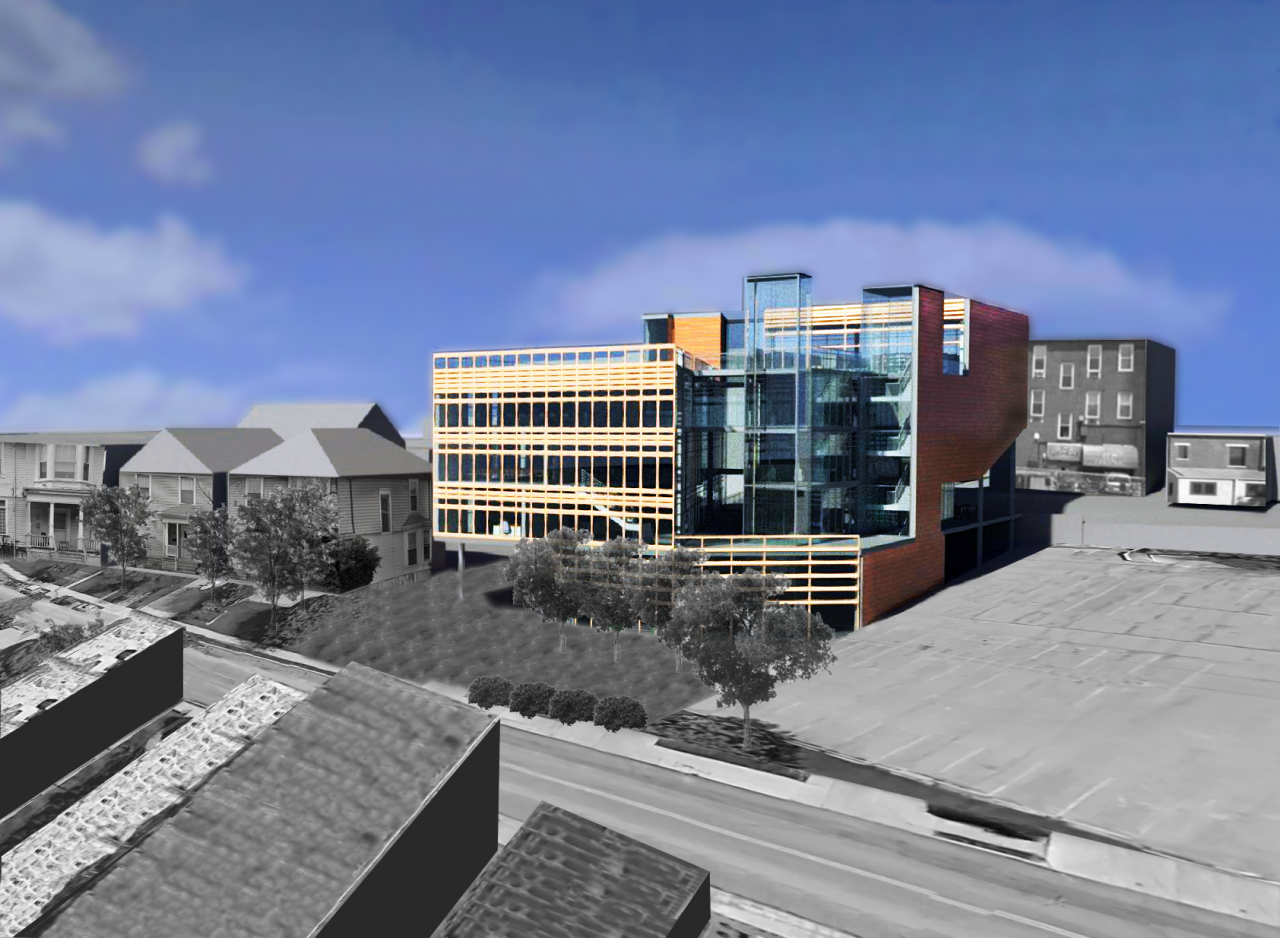
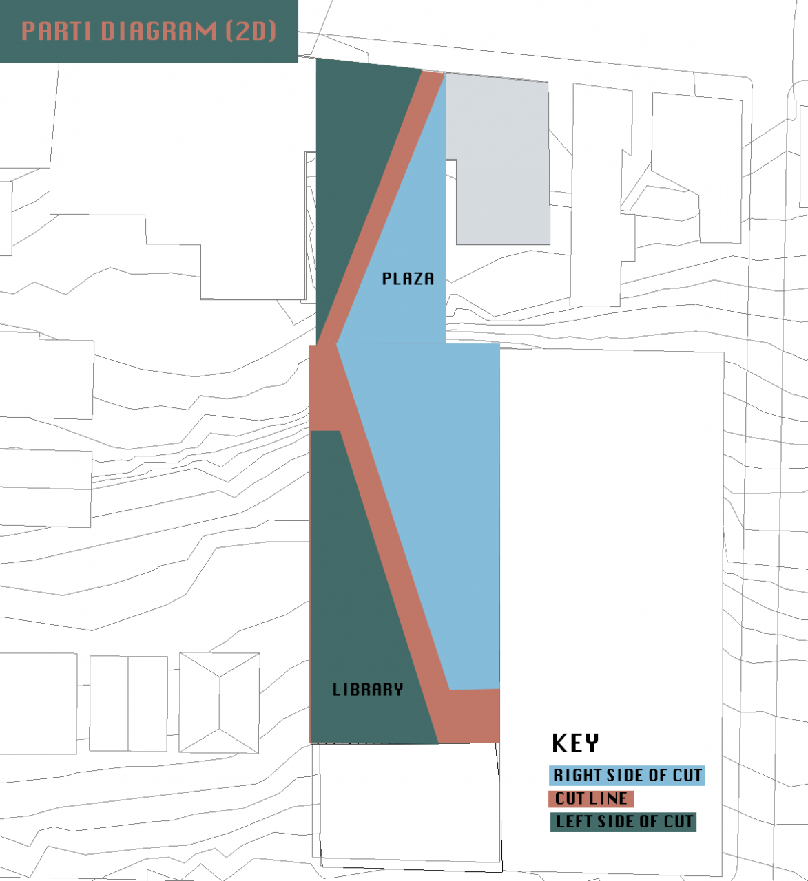
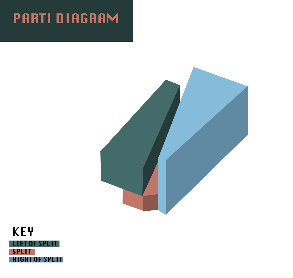
My concept for my Clifton Library was initially derived and continuous from my concept in my Clifton Park. This park is the entrance to the library, and I wanted both designs to be fluid and continuous. In my Clifton Park, I found that an urban park is essentially a break from the every day life. By entering the park, you are breaking from your day to day routine. I wanted to continue this theme into my library, where the library could provide similar opportunities. The surrounding lights at night would encourage users to enter both spaces at any time of day, and provide a safe space to commute, or stop and reflect.
