



Design Studio || Spring 2020 || Second Year
A Miami University Blog





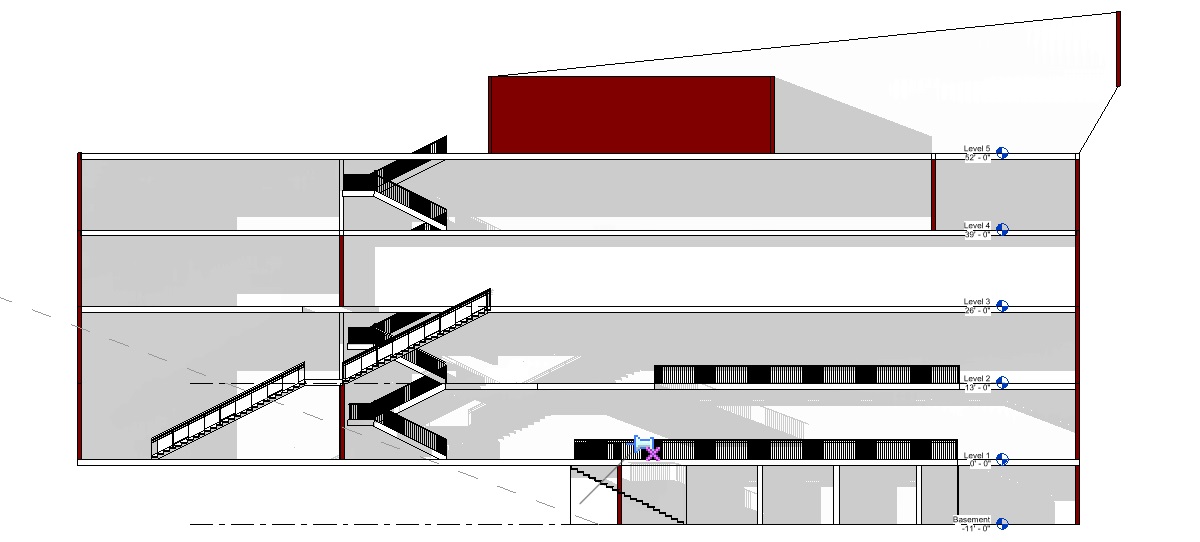
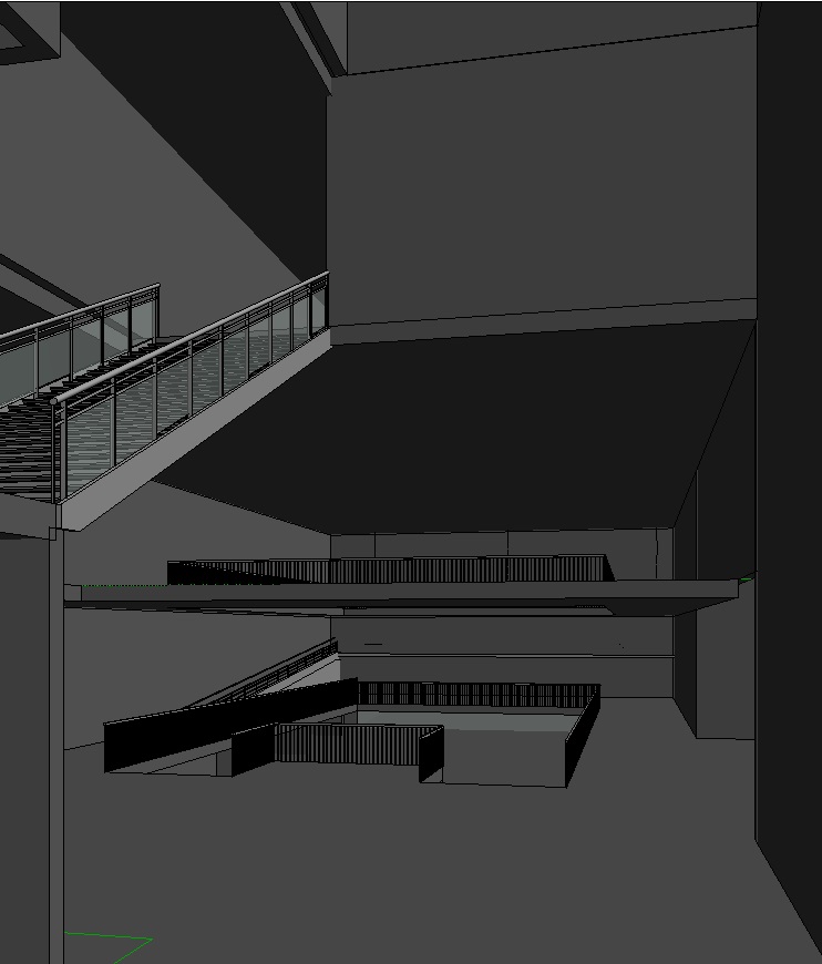
For my library project I wanted to focus on ease of access via circulation and a strong use of natural light. I have based my circulation around a center atrium that also allows light through a glass double roof to reflect light through. I have been heavily inspired by my precedents use of atrium, Carree d’art.
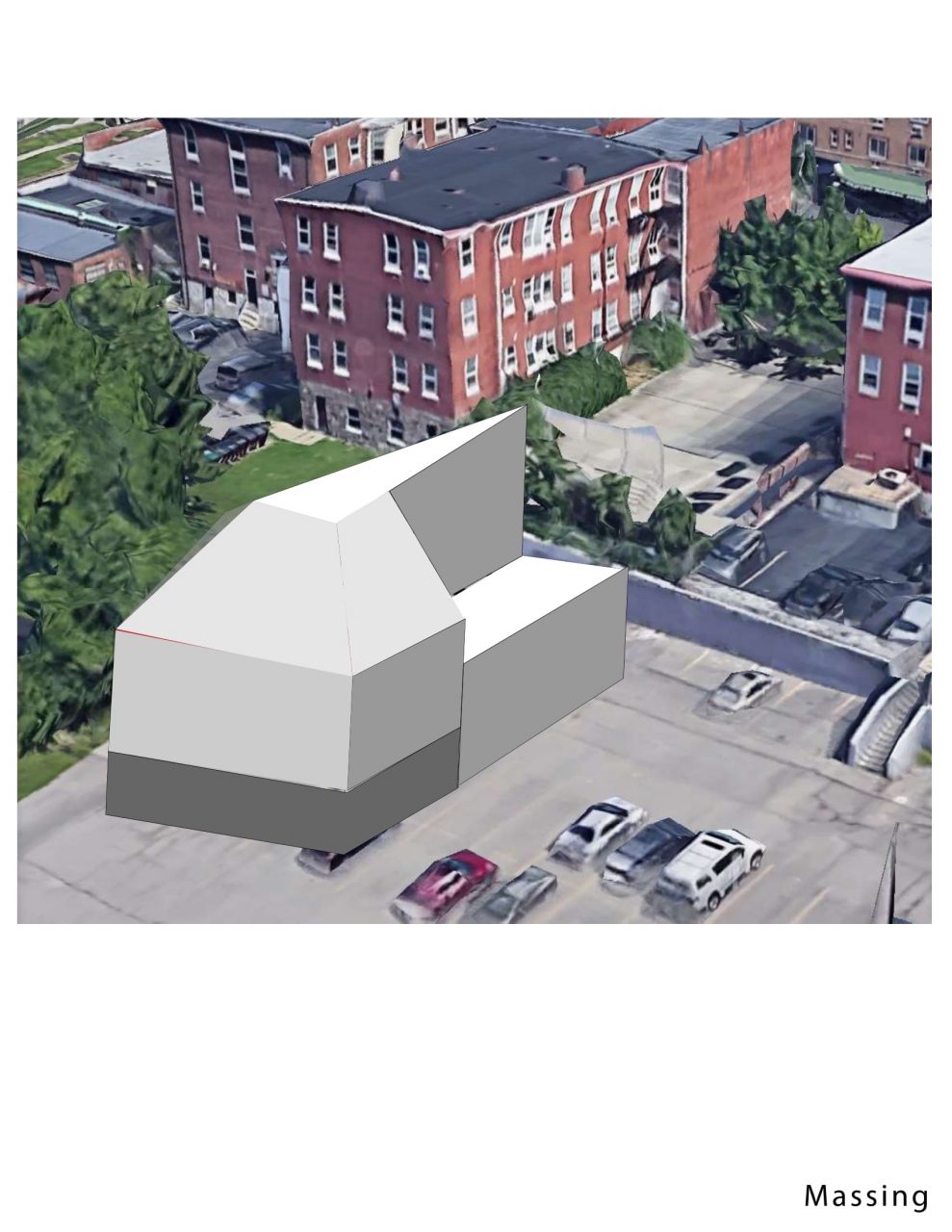
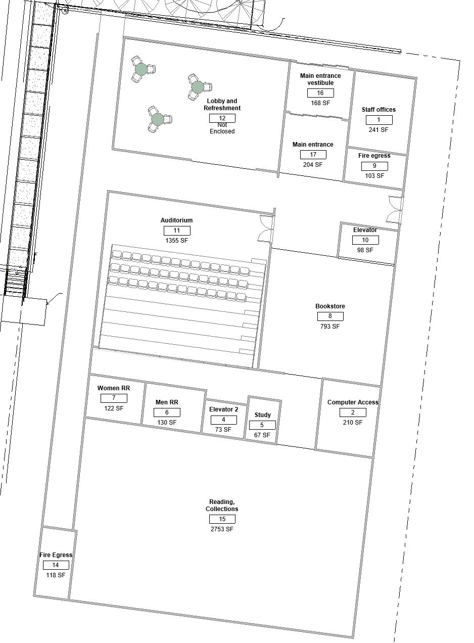
My library design was built around the organizational idea of a central helical ramp. The aesthetics of the building are based off of my Clifton Plaza project, the circulation system and diagonal mullions are a reference to the structure of that project.
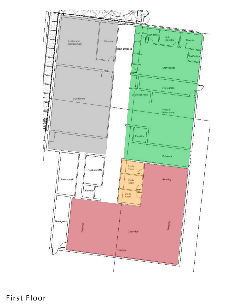
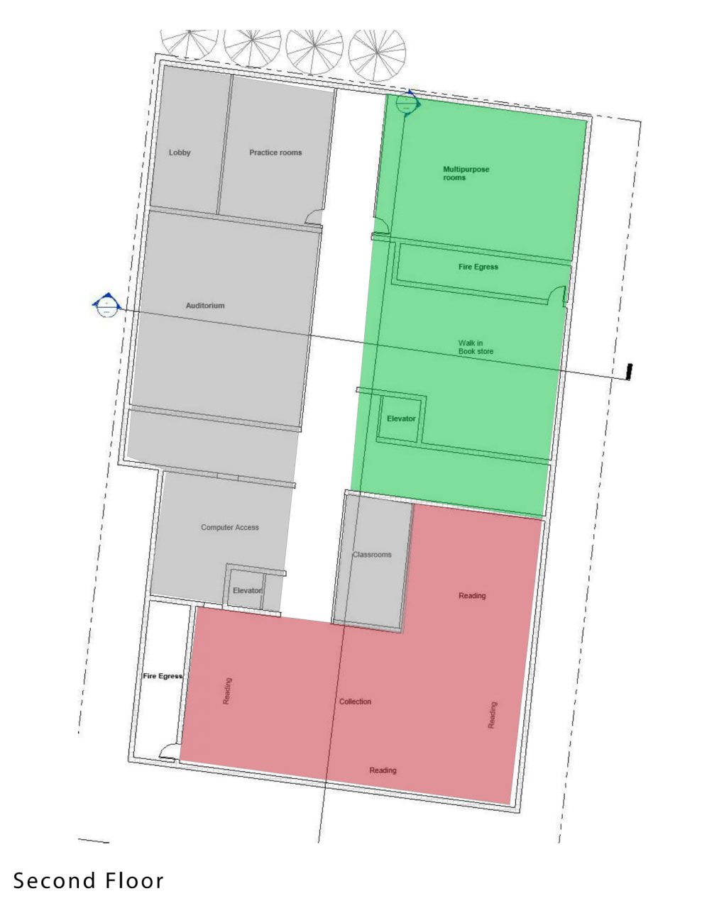
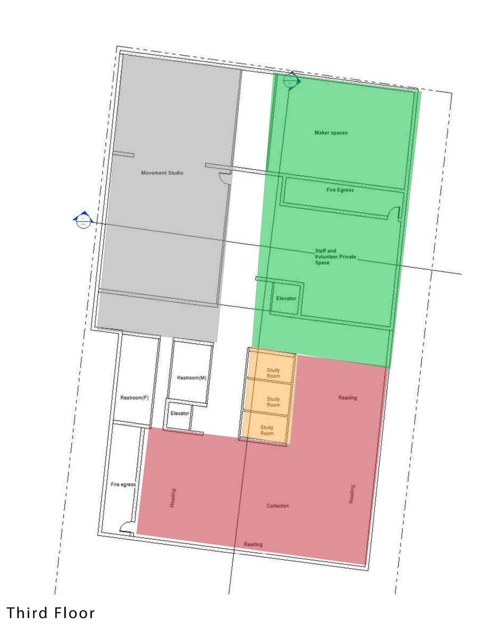
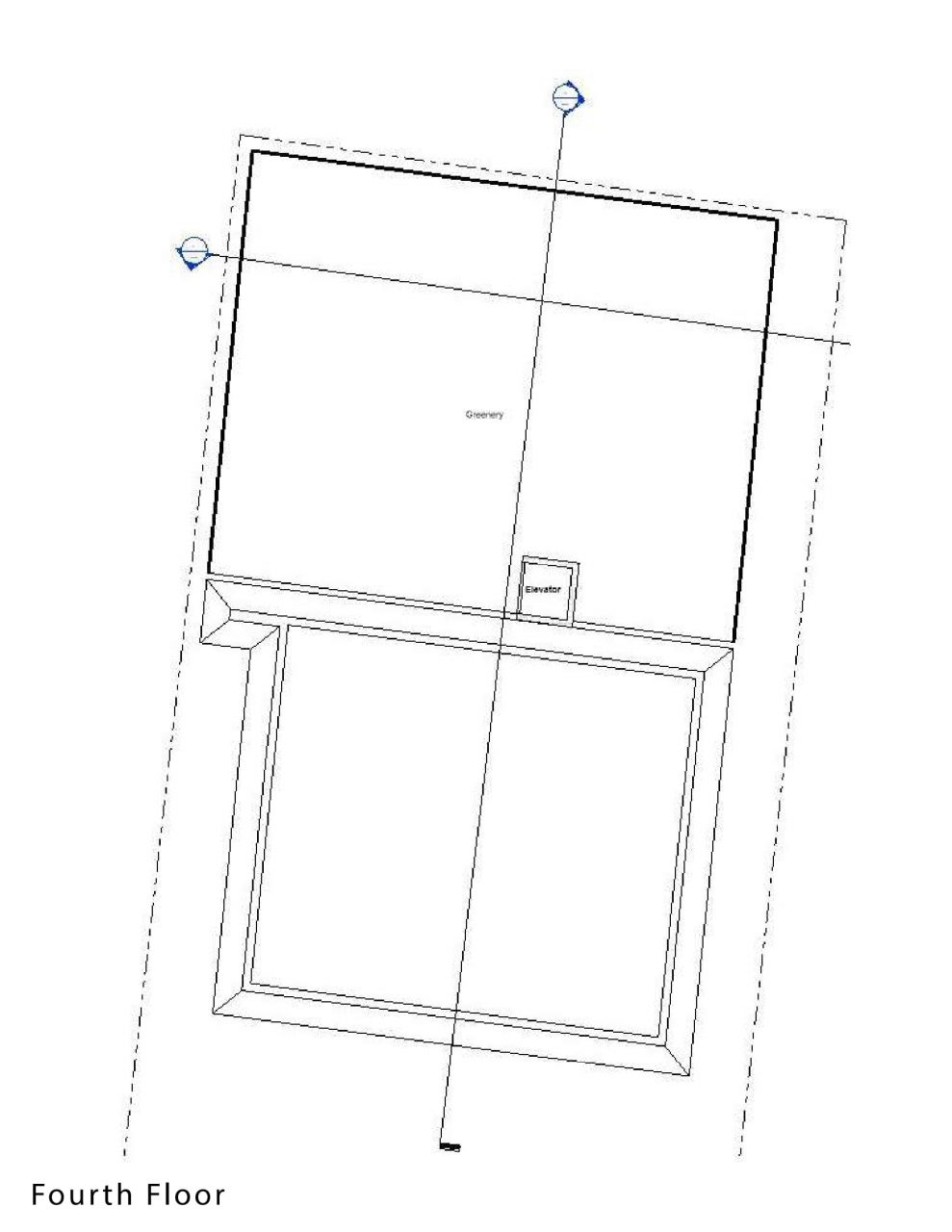
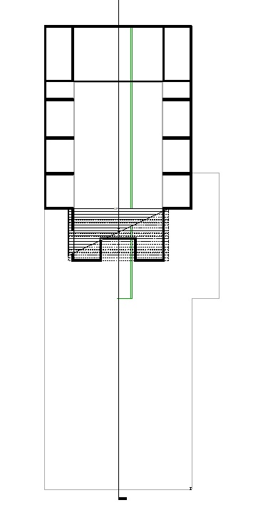
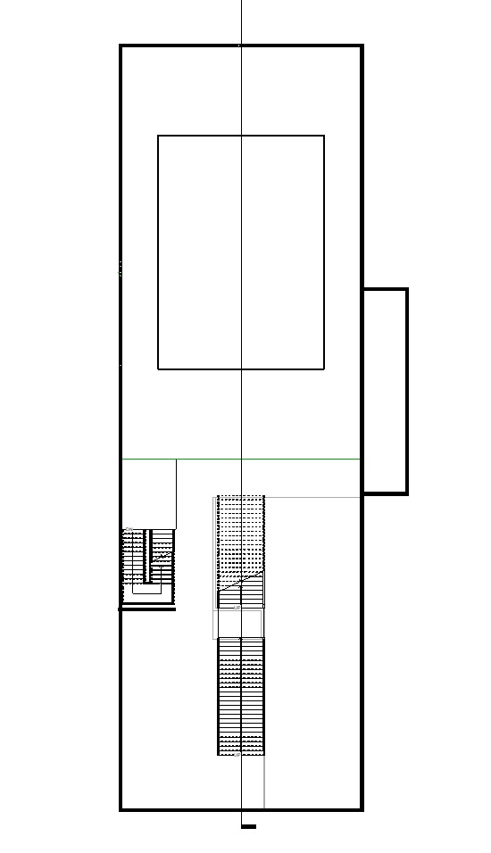
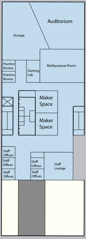
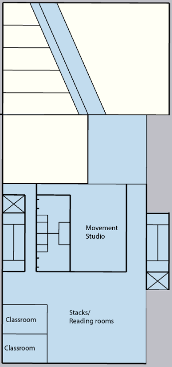
Preliminary floor plans: the arrow indicated the main circulation ramp that connects the whole building. The open courtyard space in the center of the buildings holds the egress stairs.
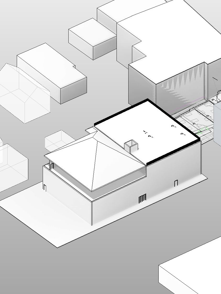
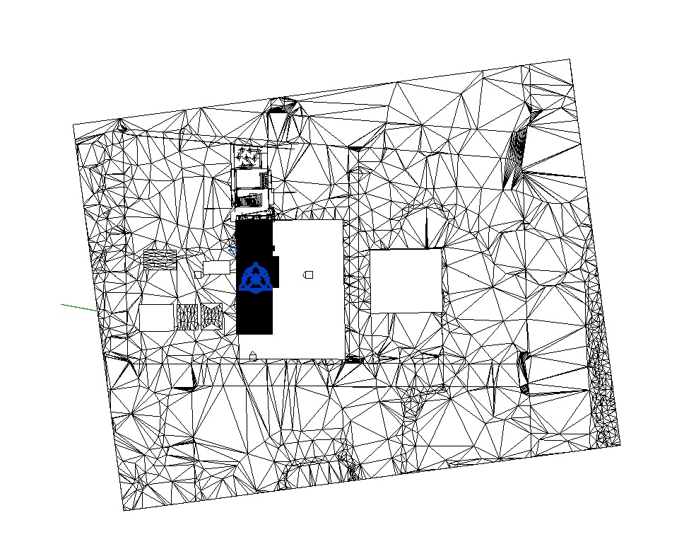
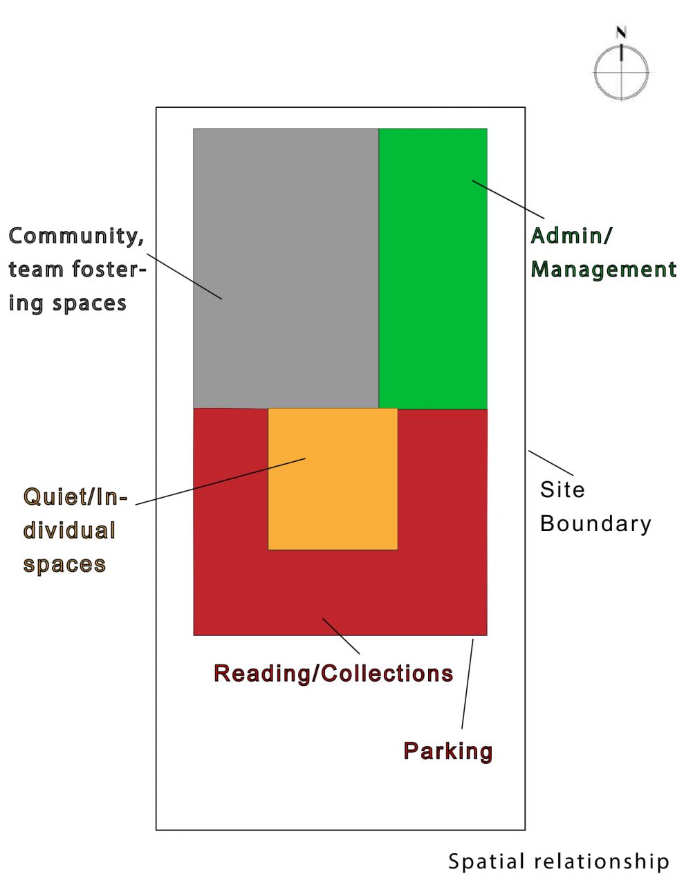
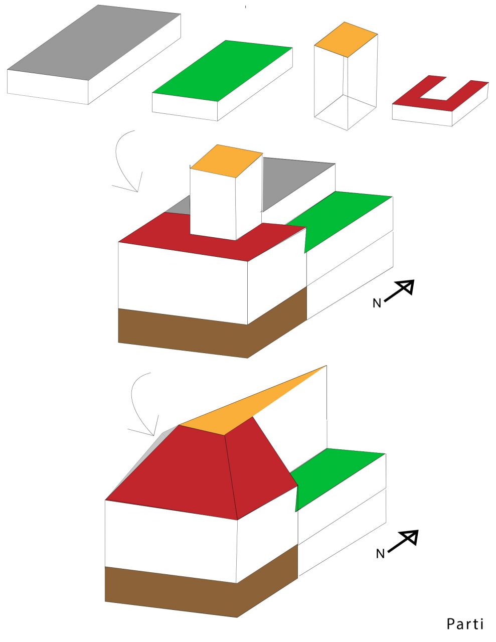
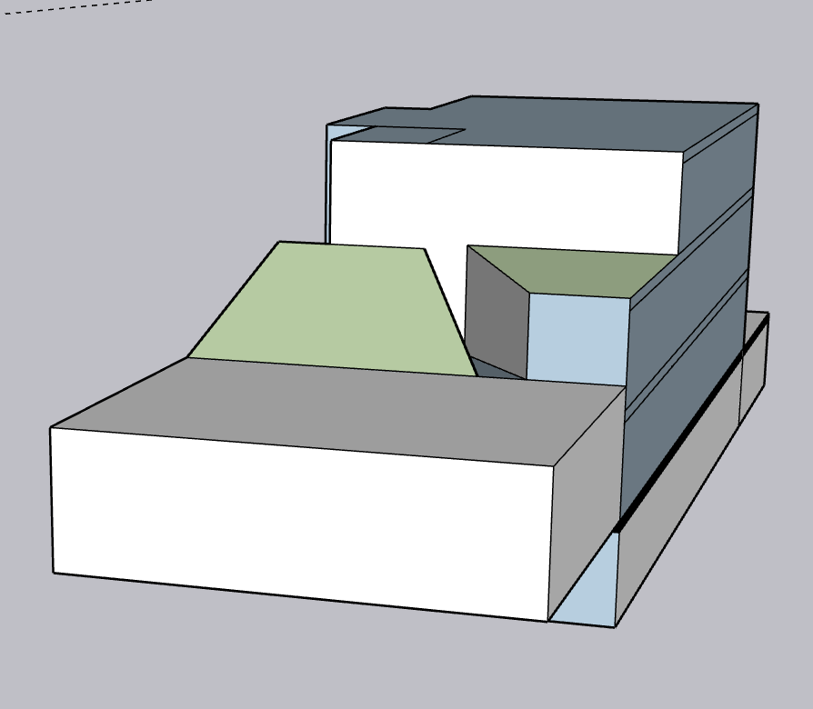
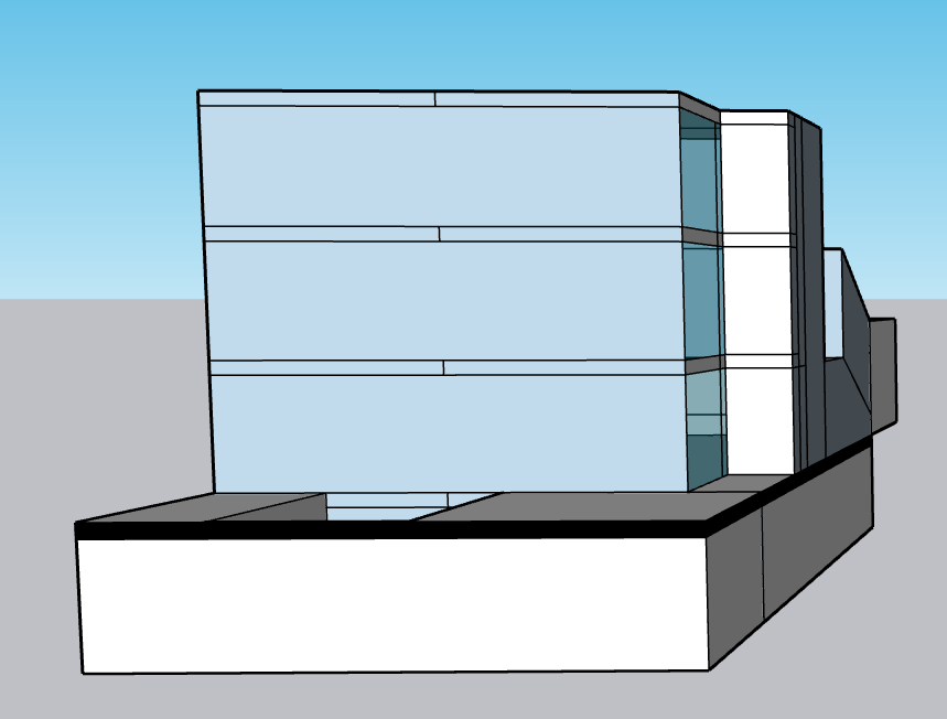
Preliminary renderings and bubble diagrams. Here the form of the building can be seen withing the context of the site.
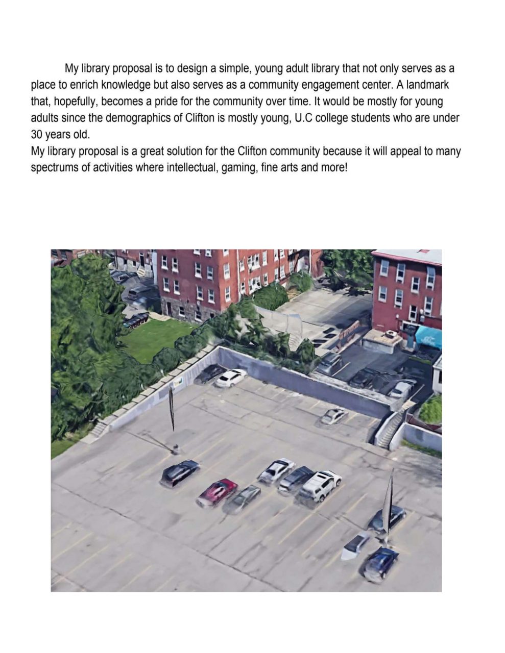
The design I created for this library started out with me thinking about how to create a space that is comfortable and simple but intriguing. I wanted my building to have a lot of natural light highlighting my elements inside. I also wanted to connect Clifton Plaza with my design creating a space that flows.
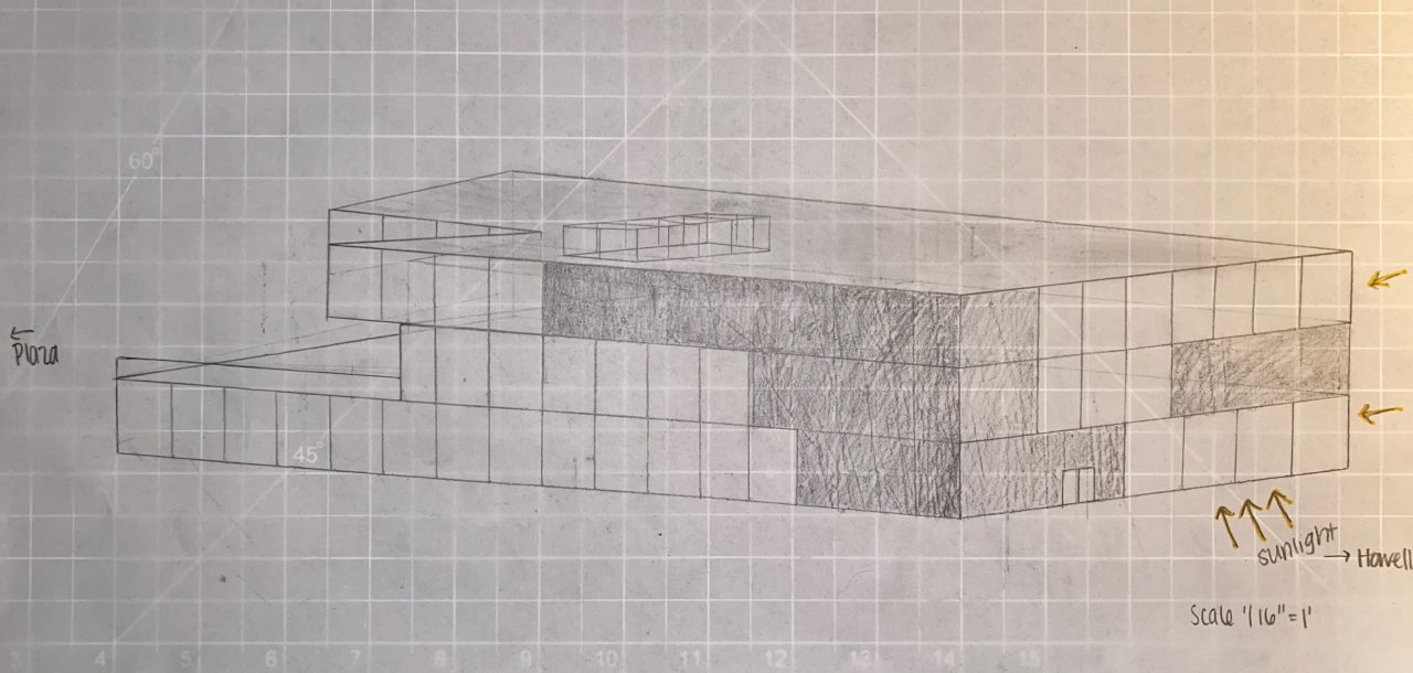
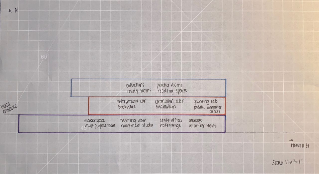
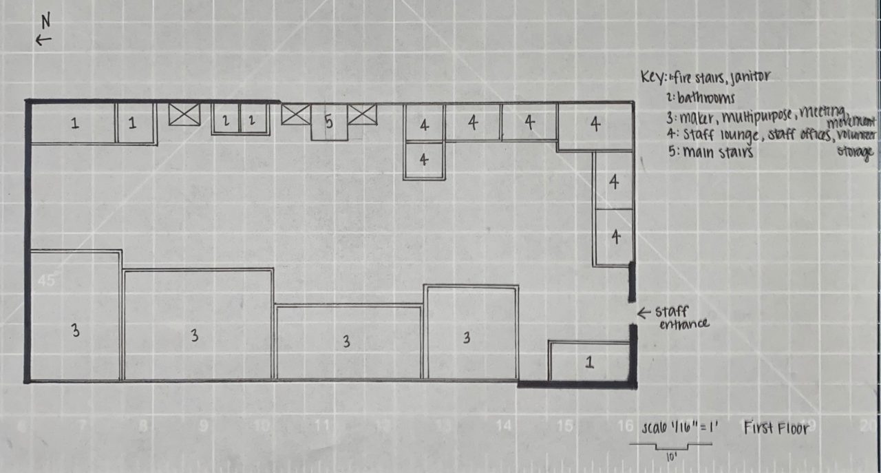

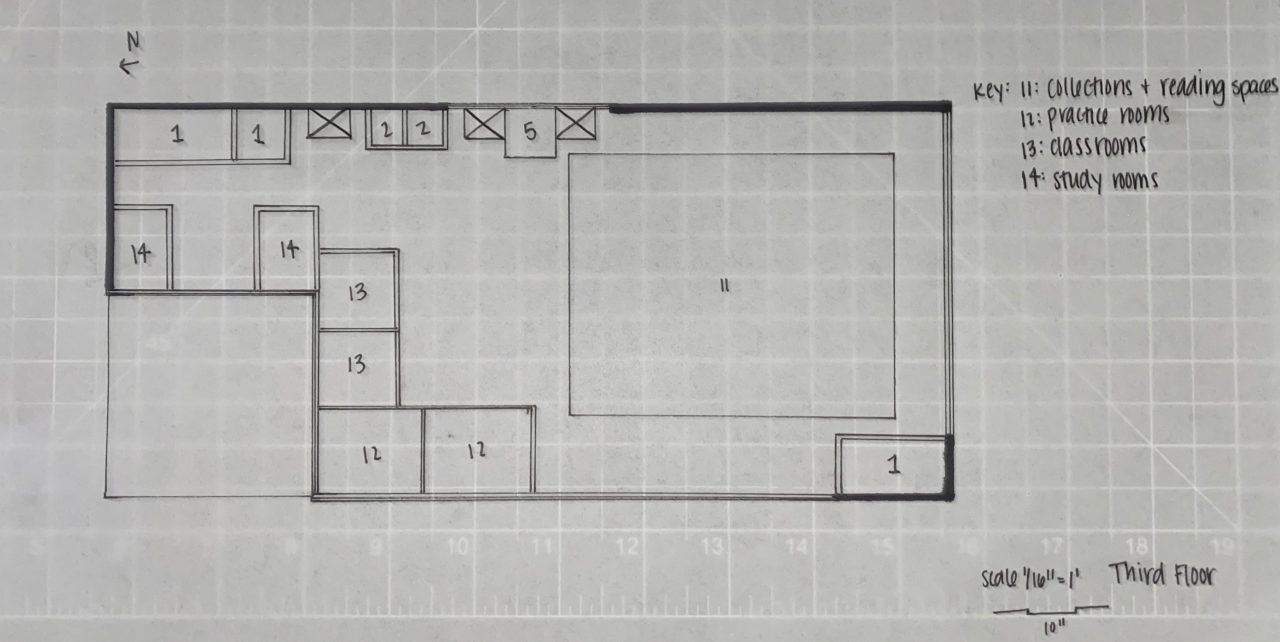
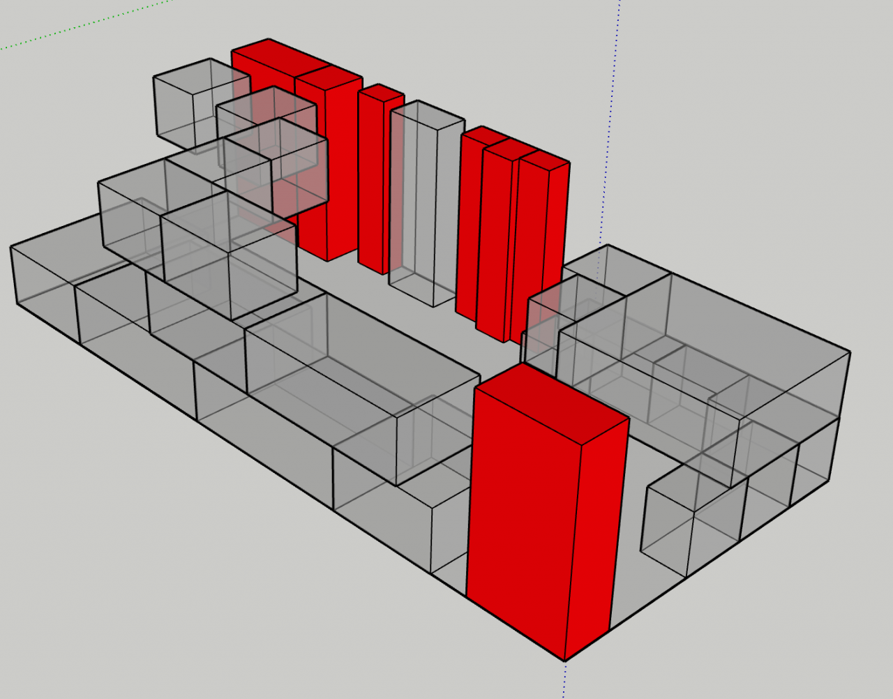
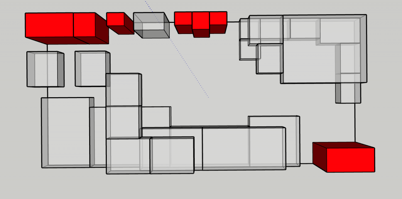
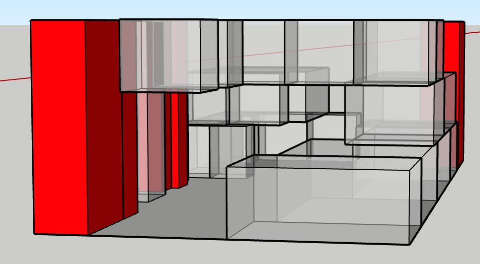
For my project, I really want to not only incorporate the circulation and use of my precedent library, Delft University of Technology Library, but I also want to integrate the use of the roof and how they created the green space that can be used for recreational use.
I think this would be perfect for the location of the park, is located in such an urban environment, and being able to extend the park to be a part of the library. truly integrate it with the site and general area and explode it from a pocket park to an almost real park. In my “existing park site” (what I built) there is a tensile structure over the stage and I would like to integrate that into aspects of my Library project over the green space directly off the park. I also wanted to incorporate the site cuts from the plaza made through triangles going diagonal through the site.

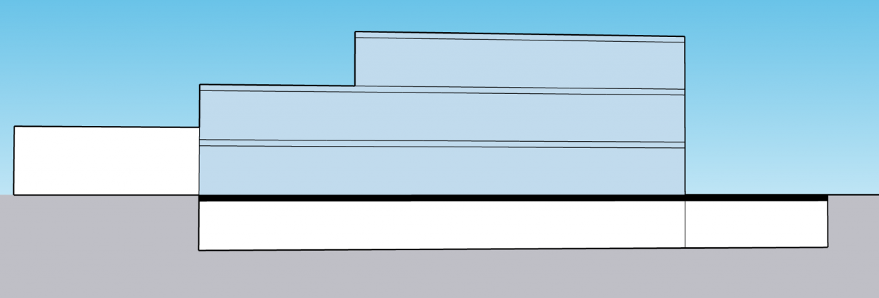
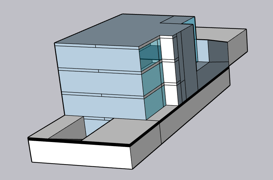

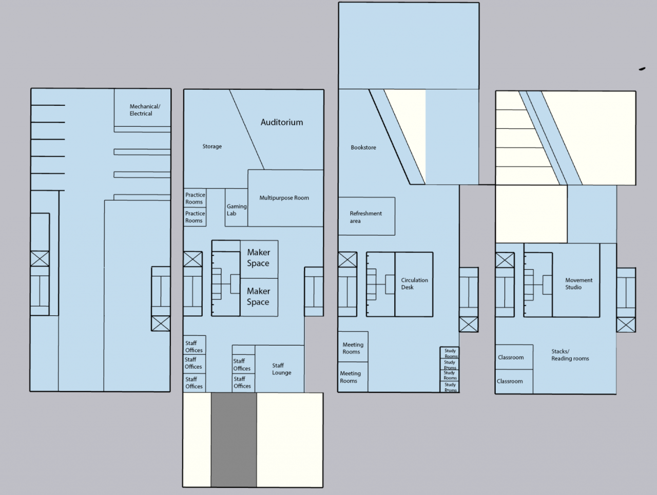


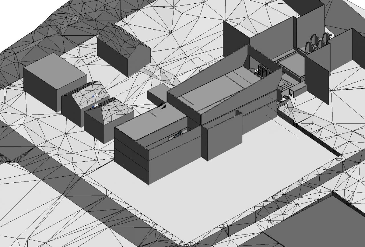
Process Massing

