





Design Studio || Spring 2020 || Second Year
A Miami University Blog


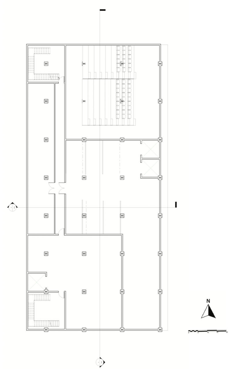
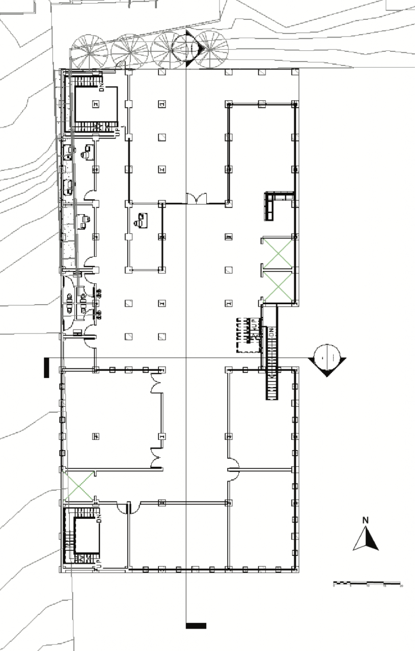
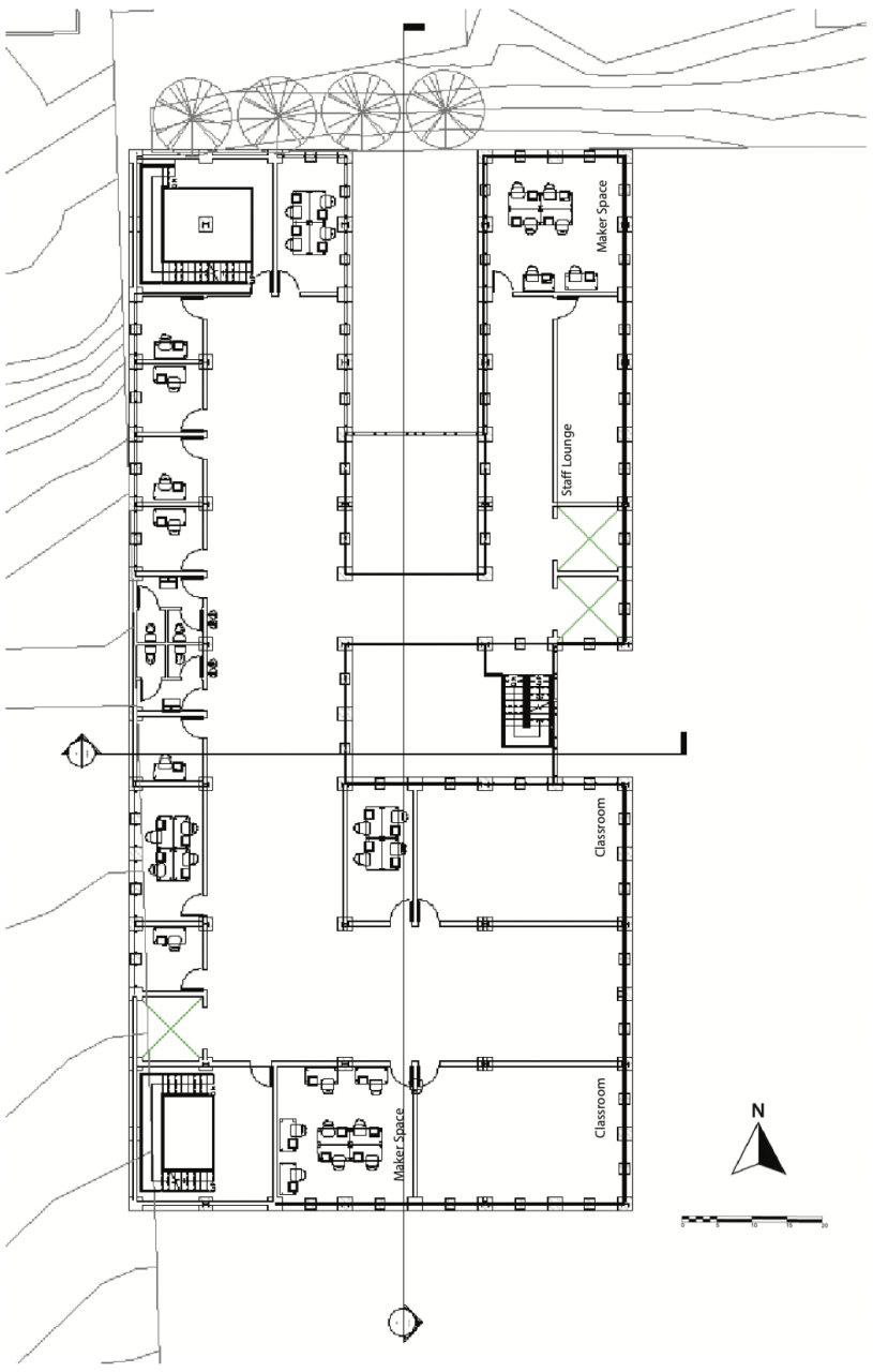
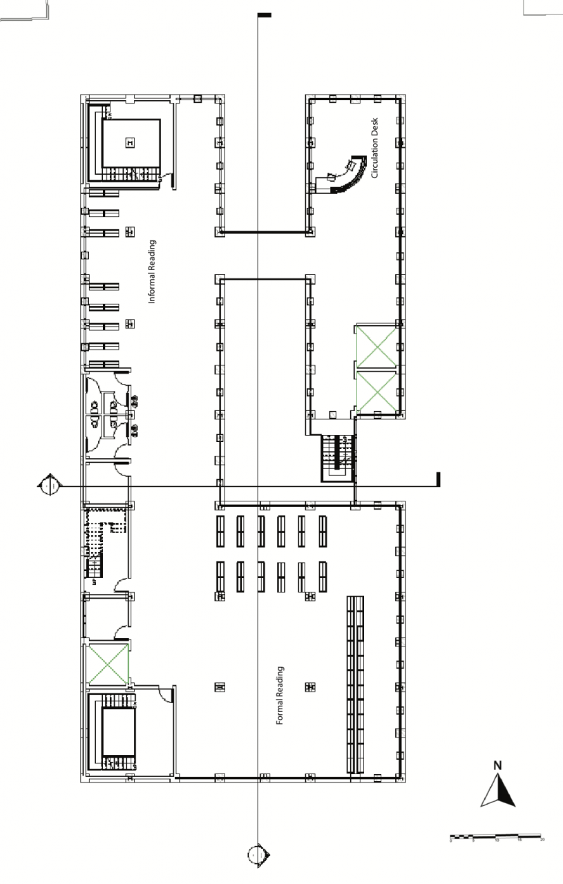
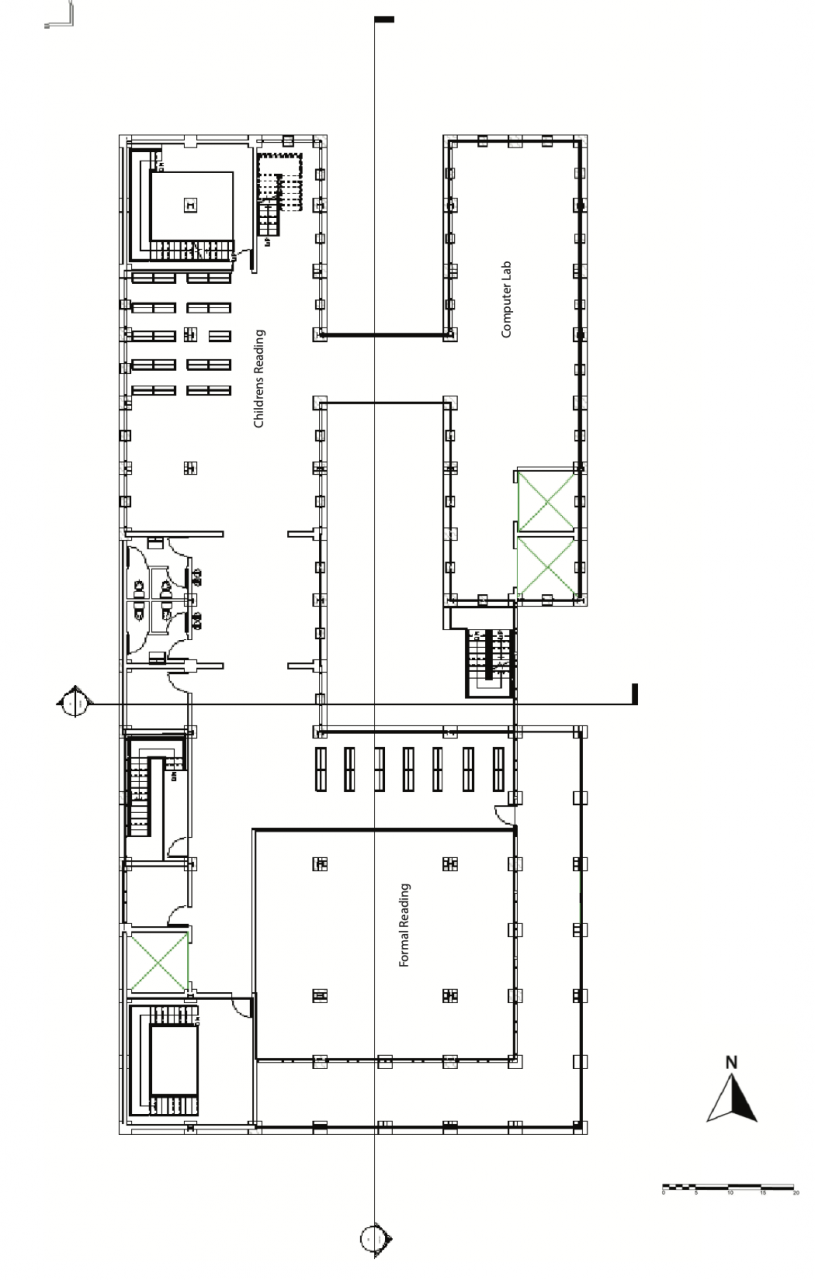
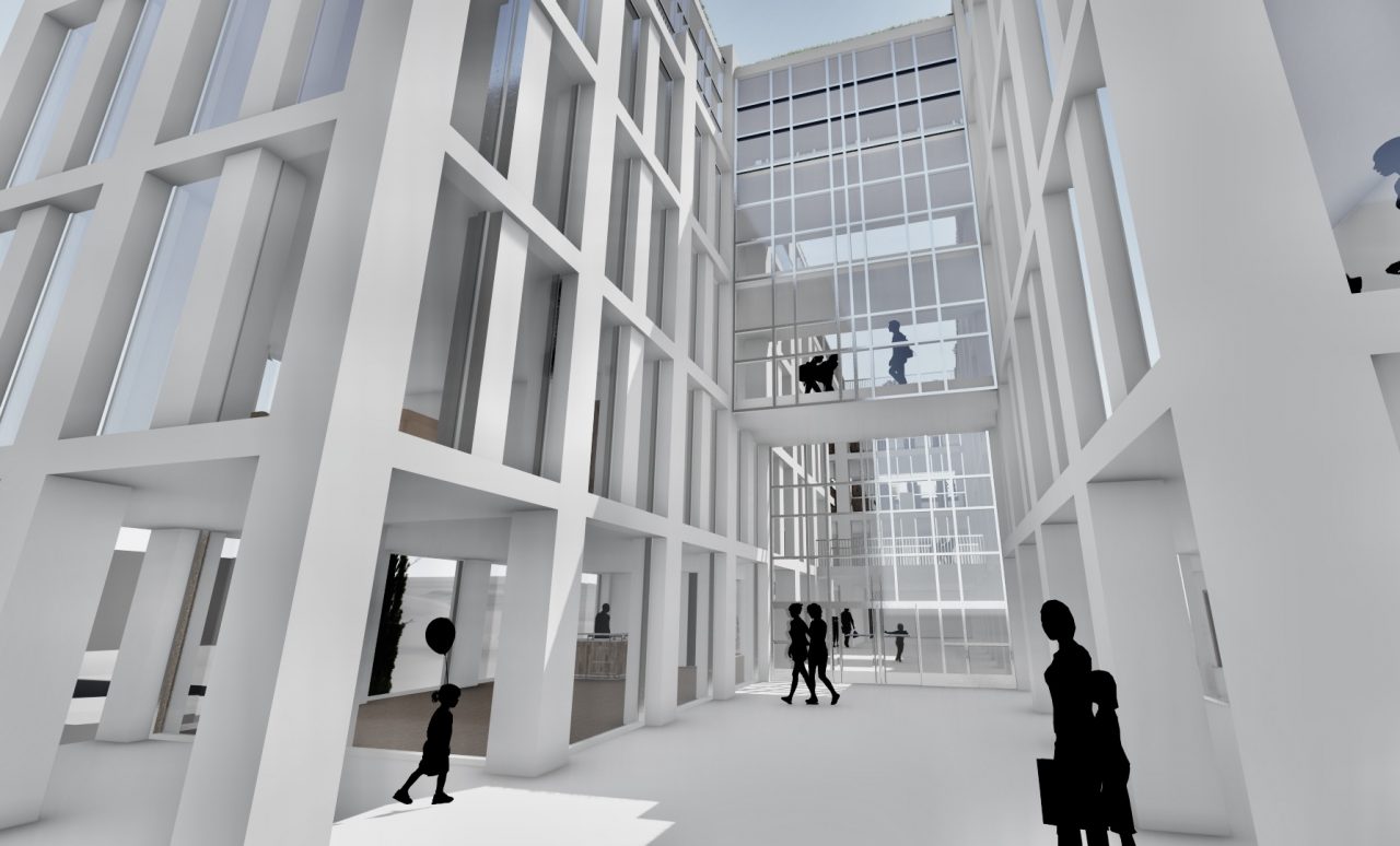
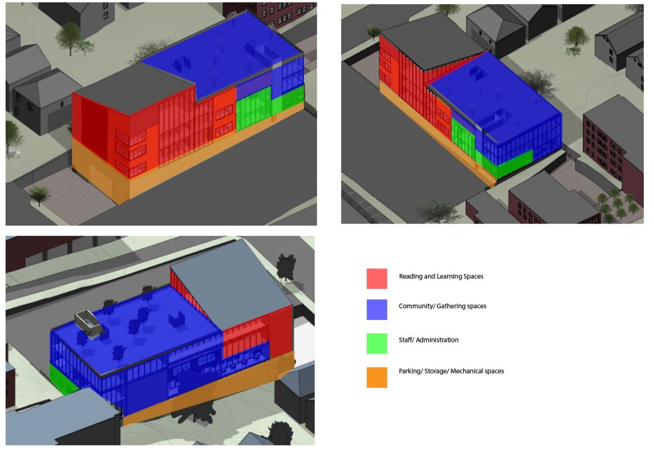
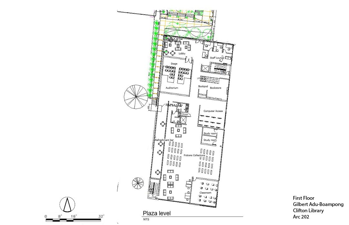
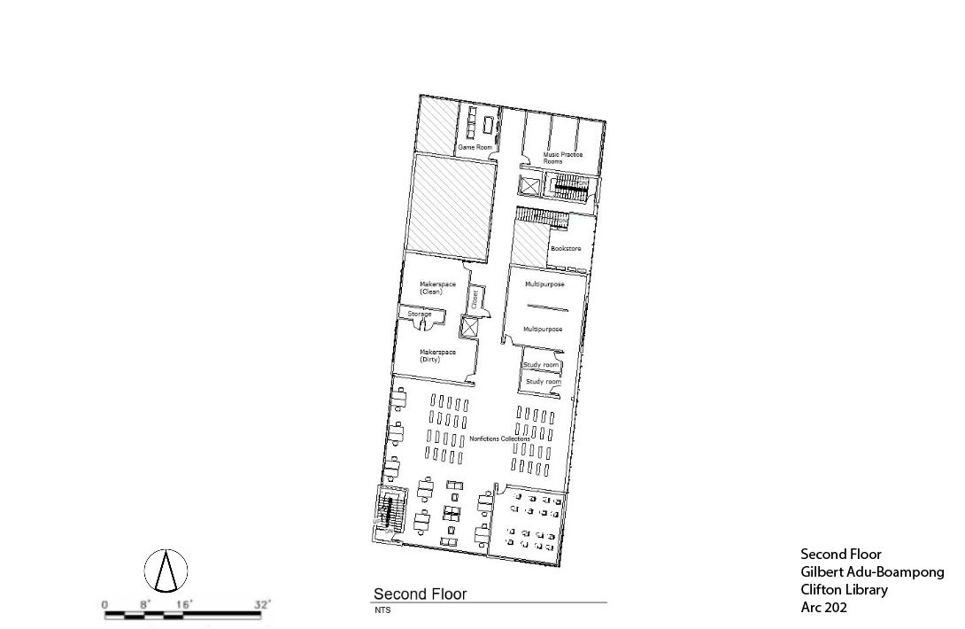
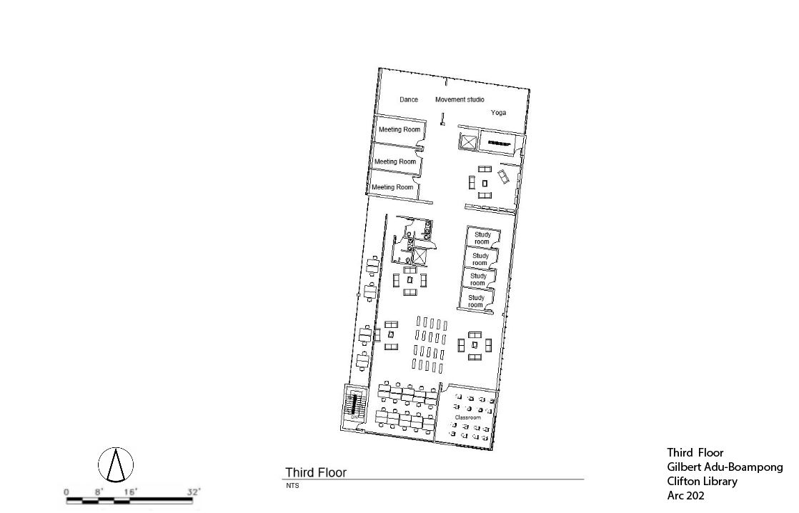
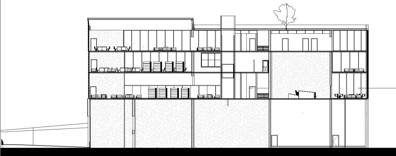
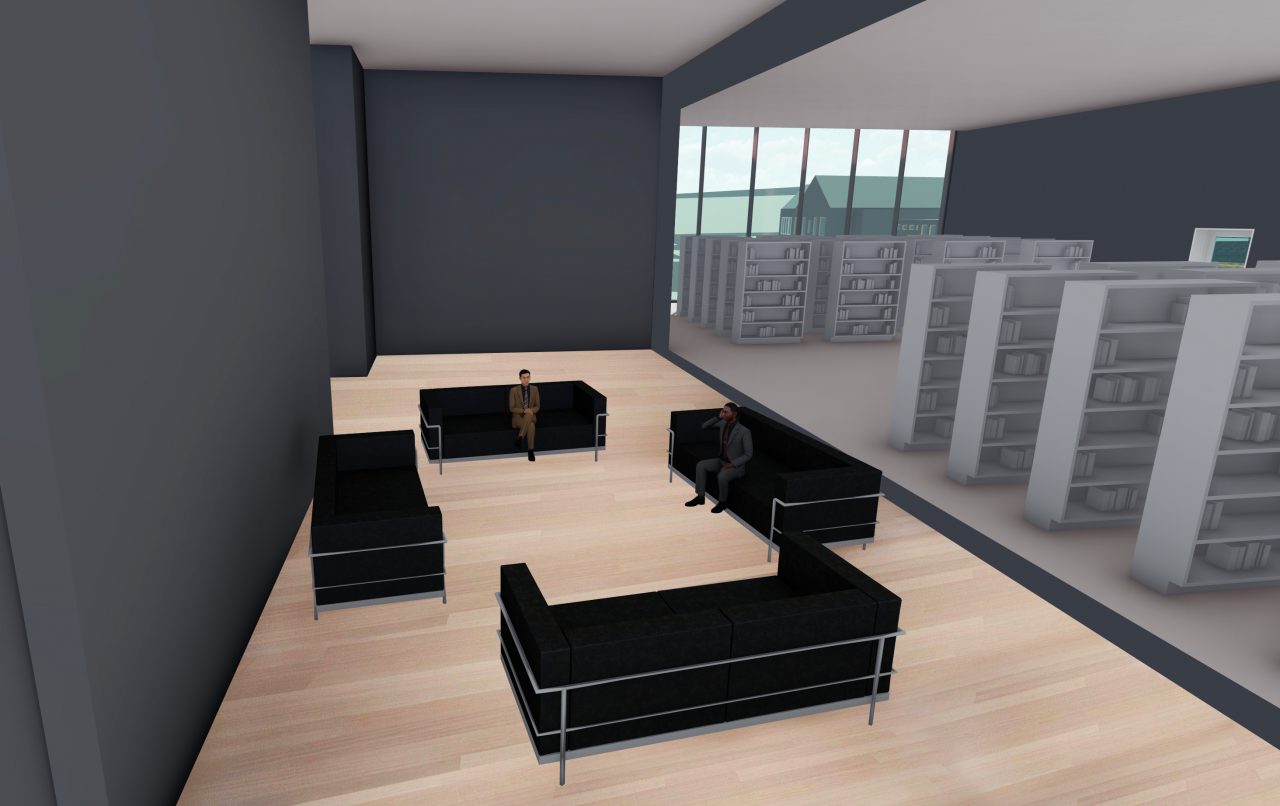
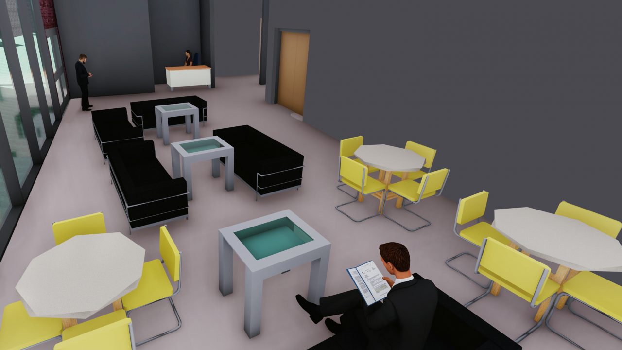
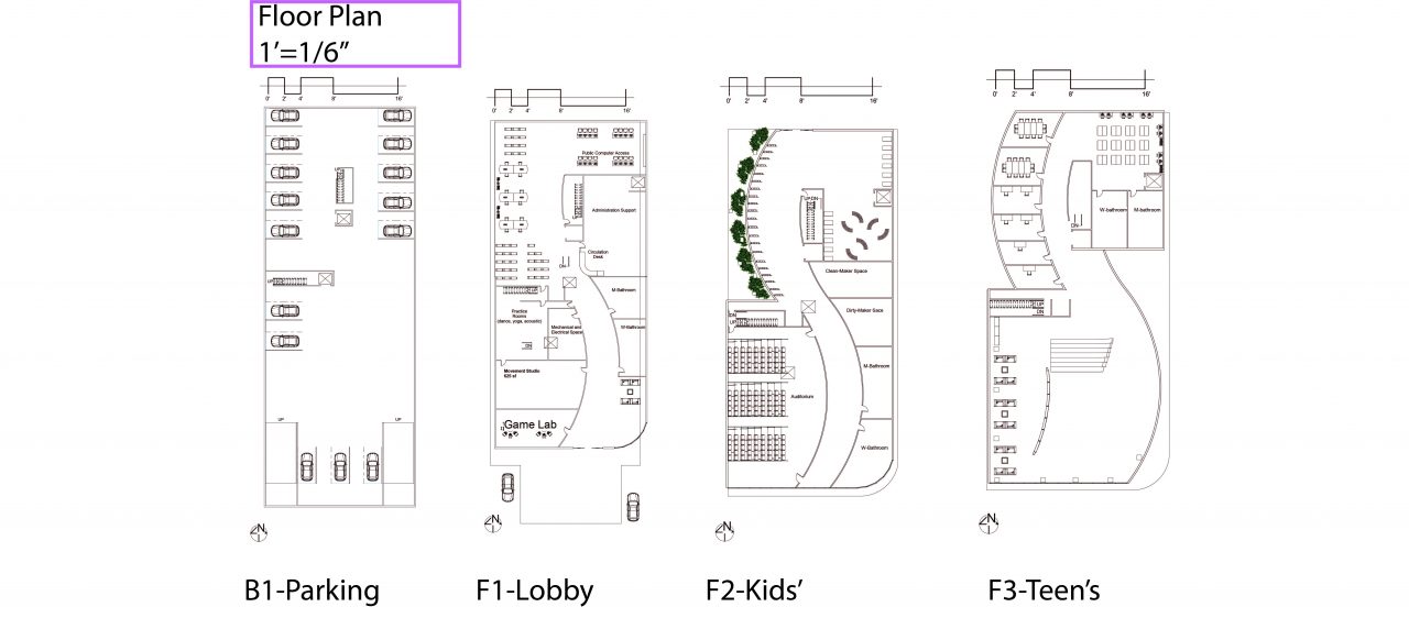
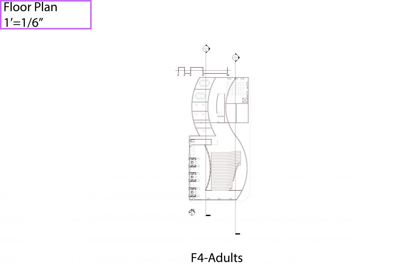
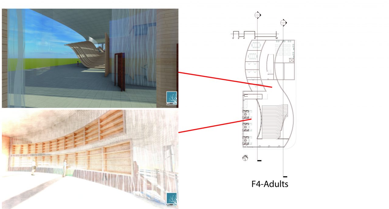
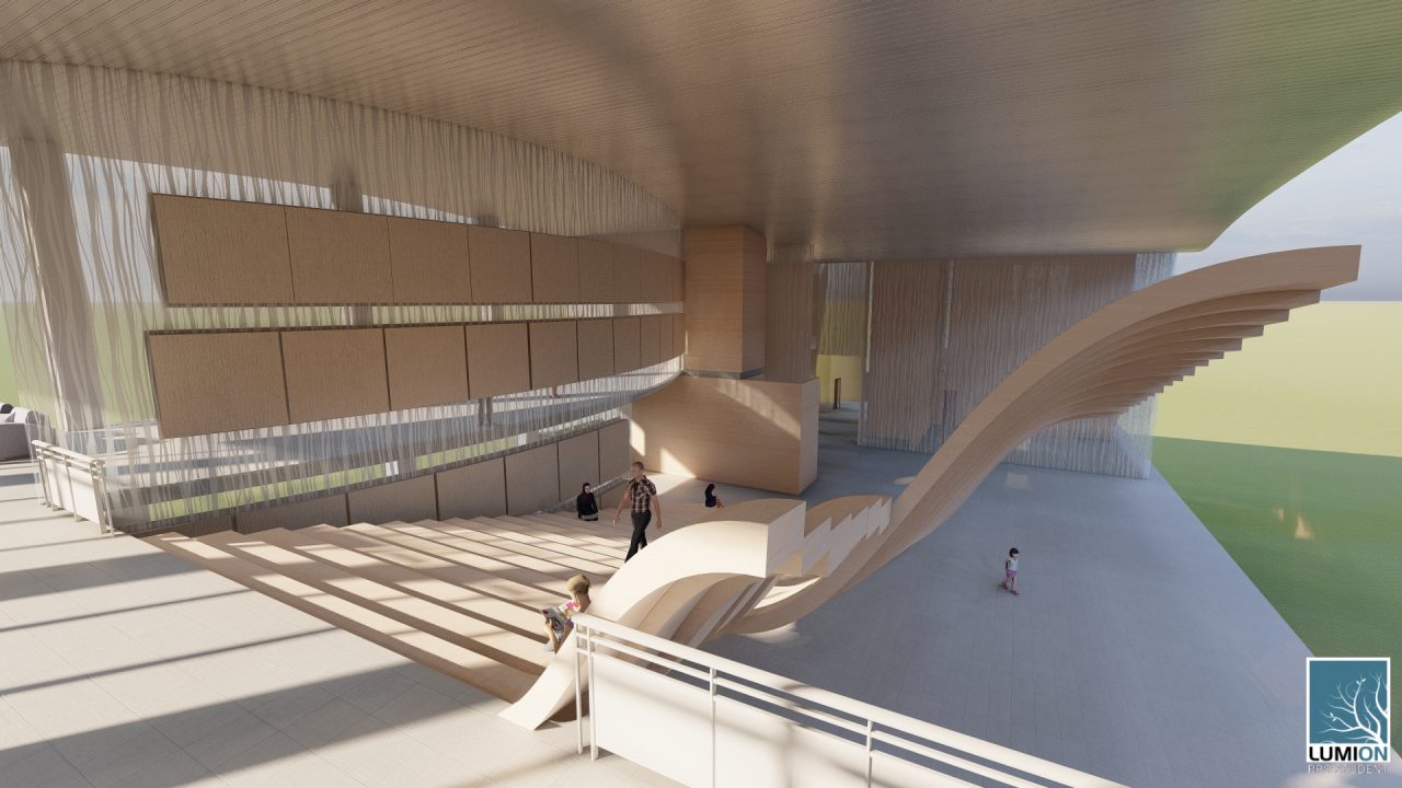
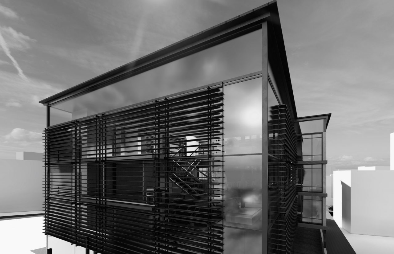
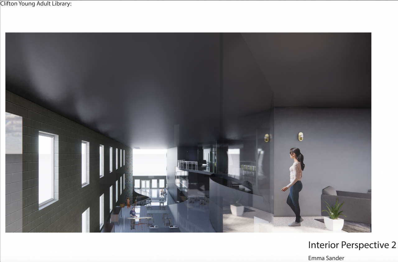
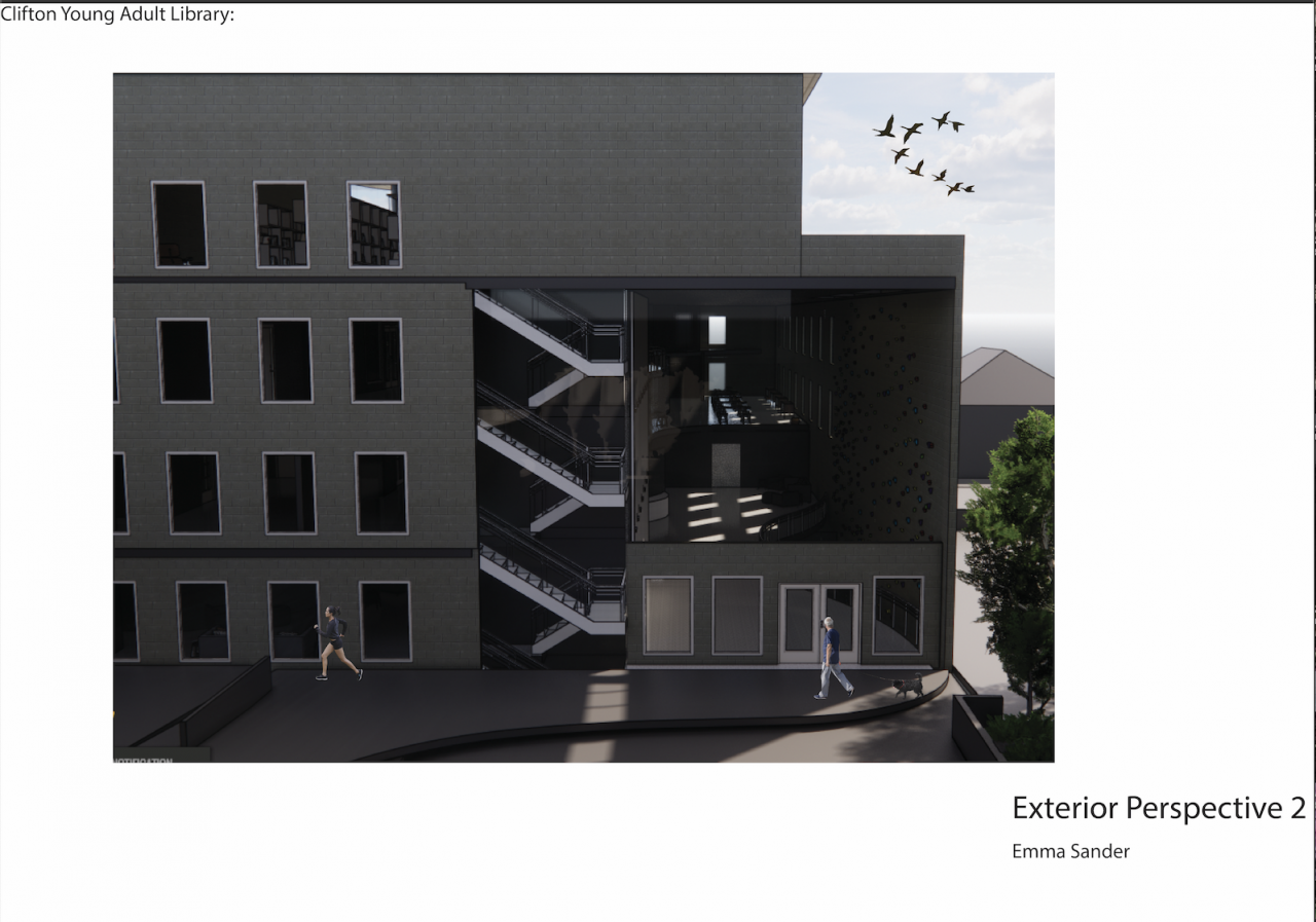
My concept is about distant connection. To be a community, we do not have to be side by side to make valuable connections. I represented this through the spaces in my building by placing similar spaces on different floors. This allows all types of people to make random connections throughout the entire space. This concept extends from the concept of my Clifton Plaza of bringing people together from different backgrounds and cultures in the Clifton community. It is also inspired by my precedent library, Carré D’art and its heavy use of glass and connecting different spaces. I want my space to act as a place for people to gather and make connections, as well as be a space for people to work, create and learn.
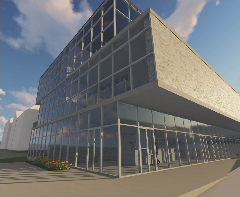
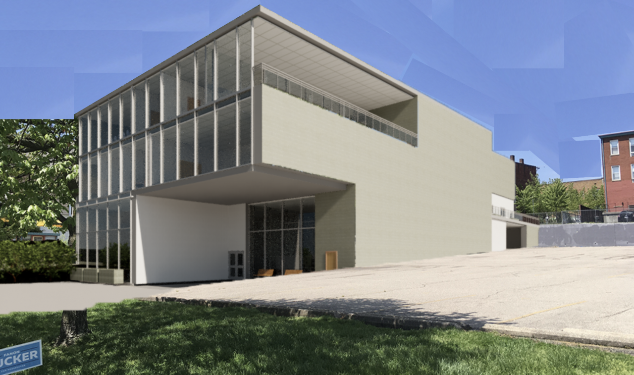
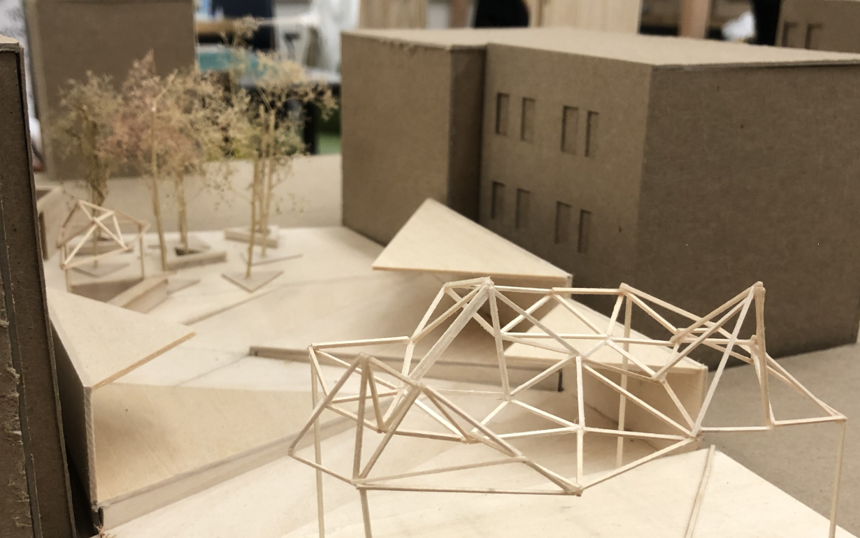
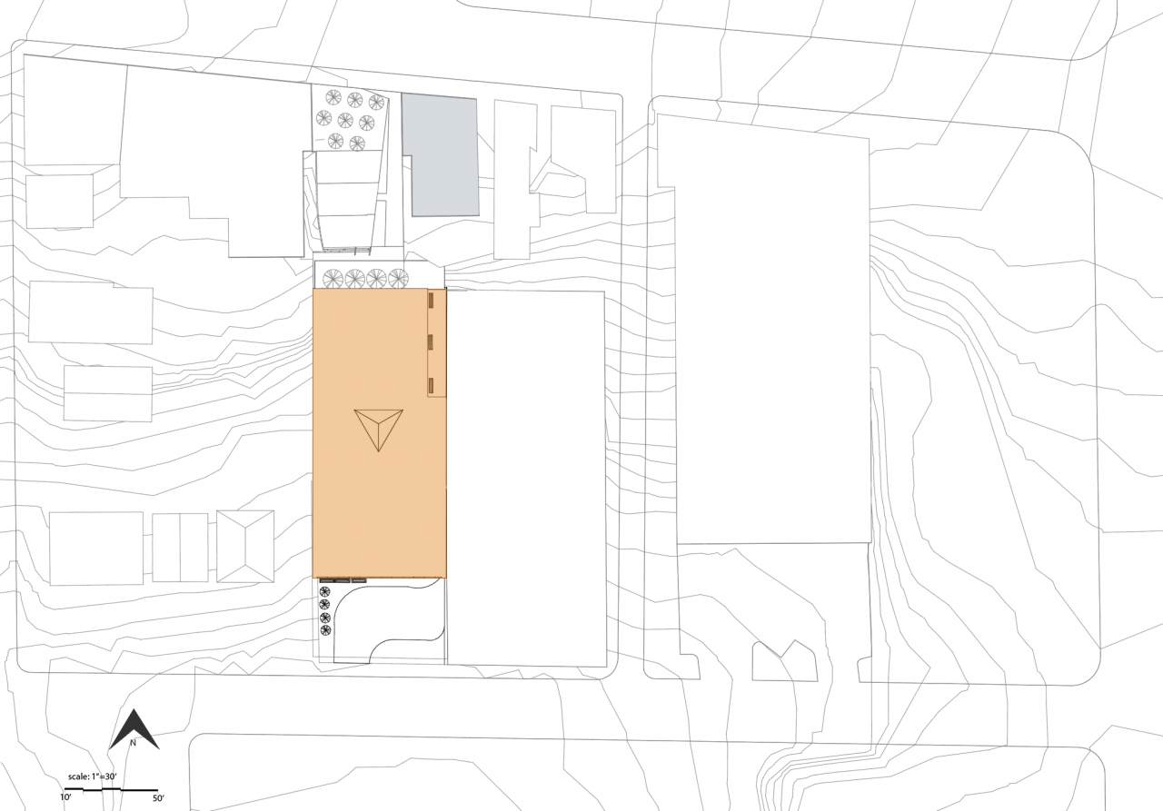
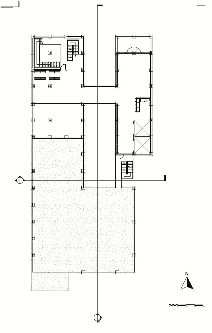
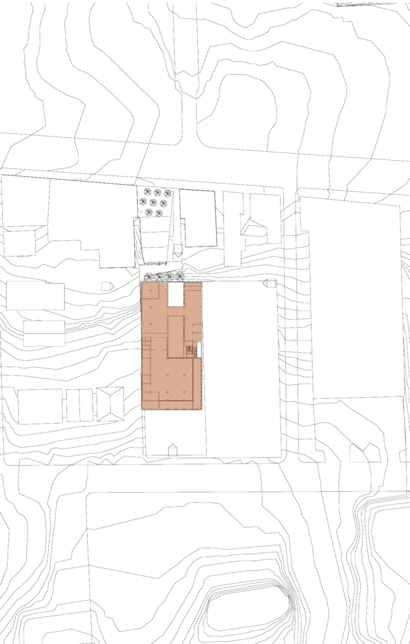
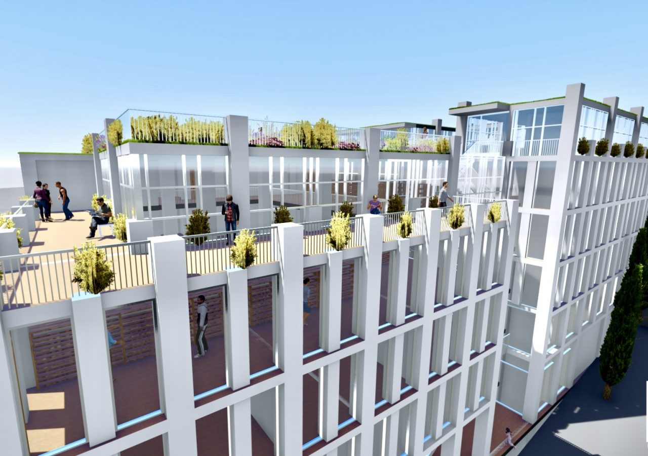
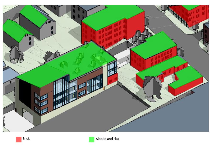
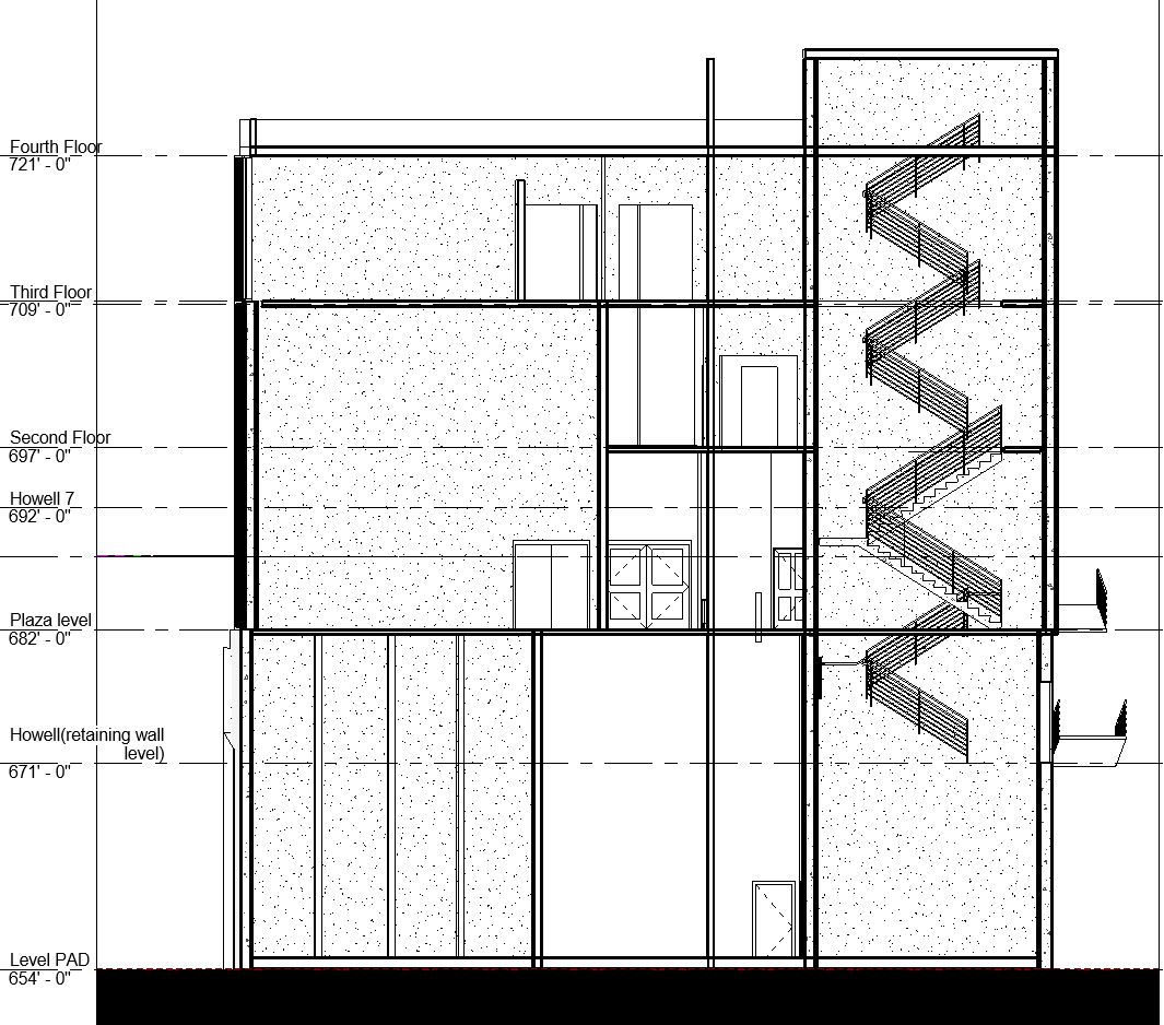
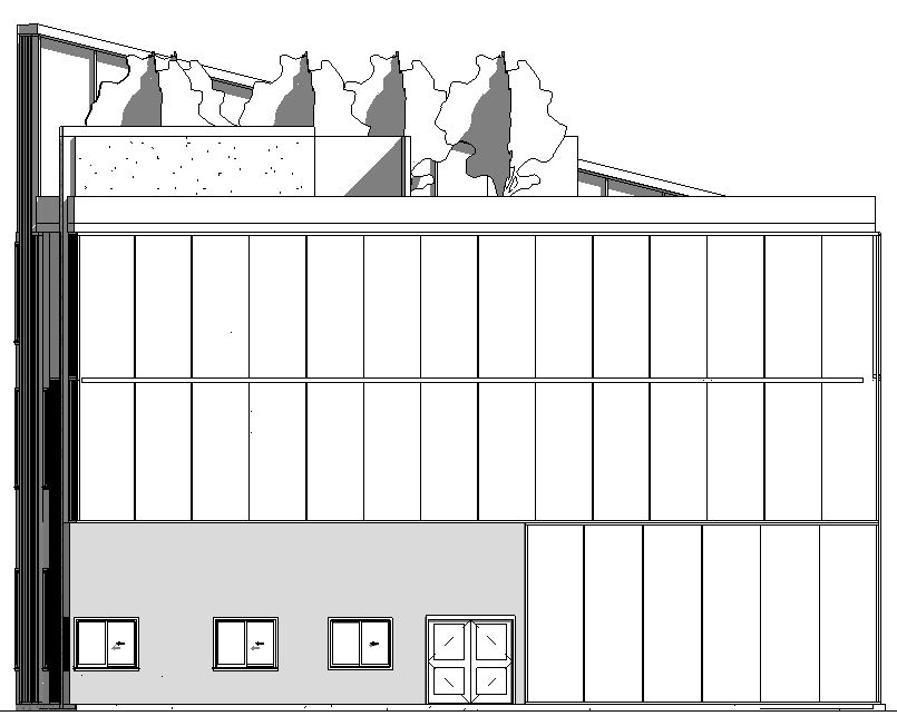
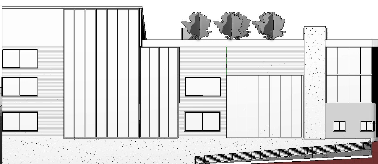
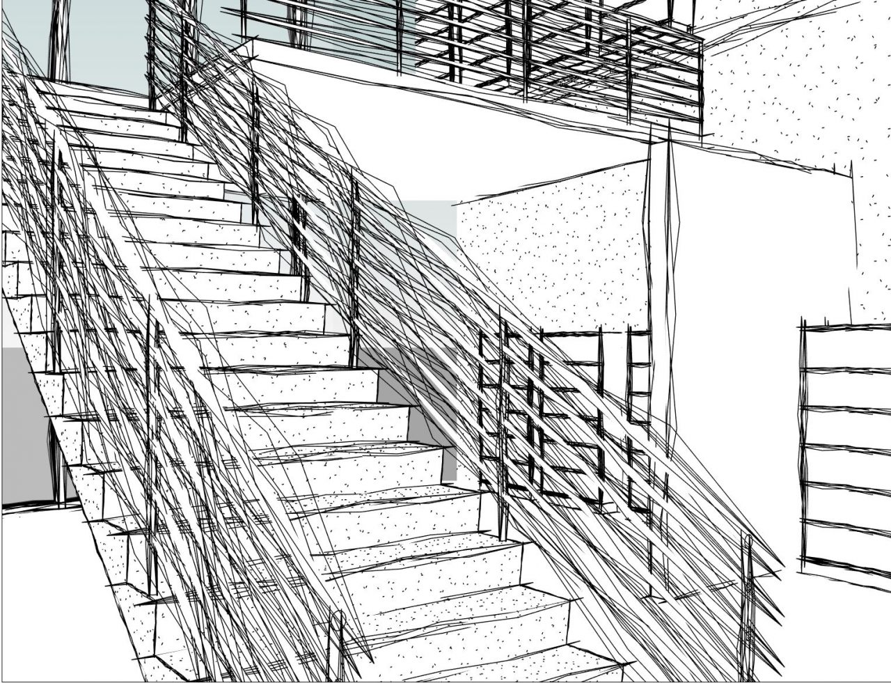
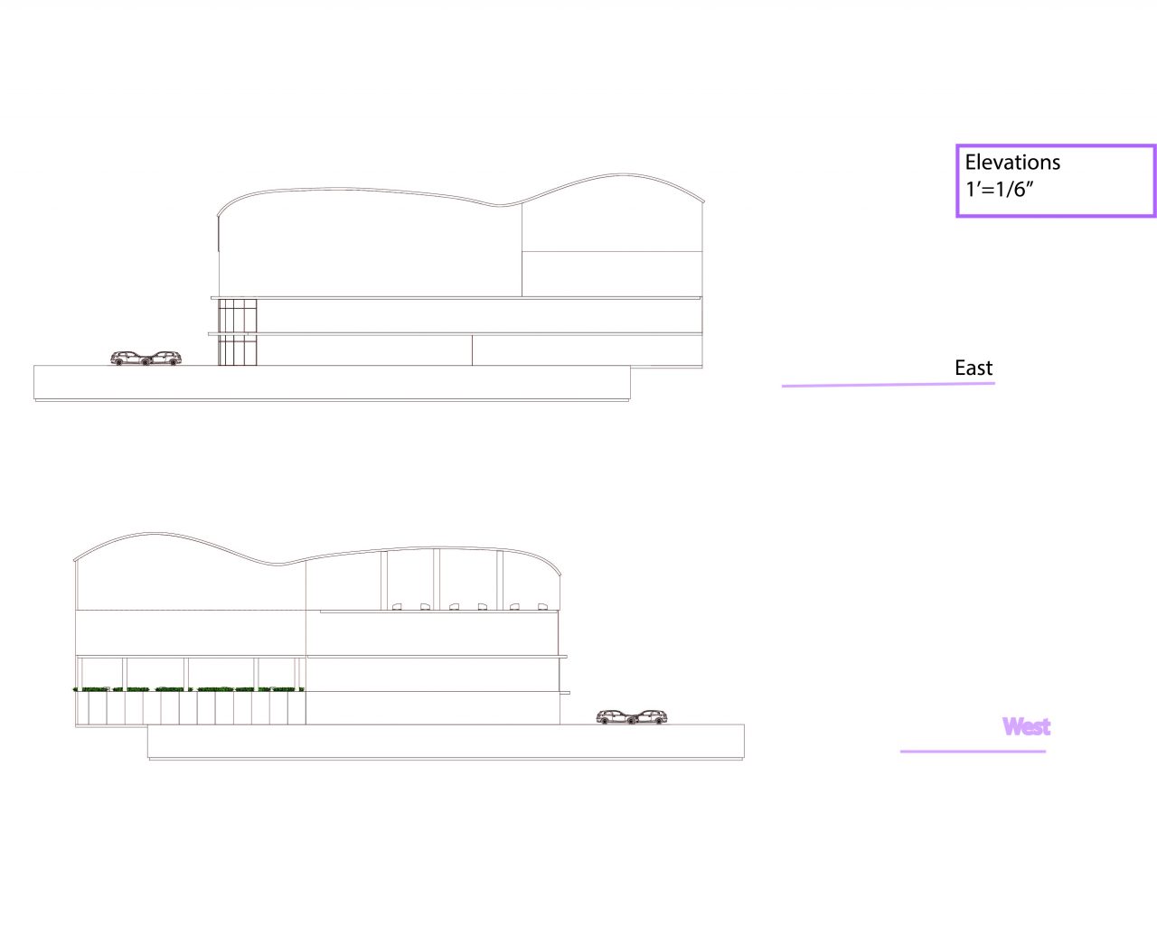
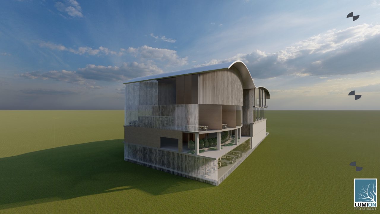
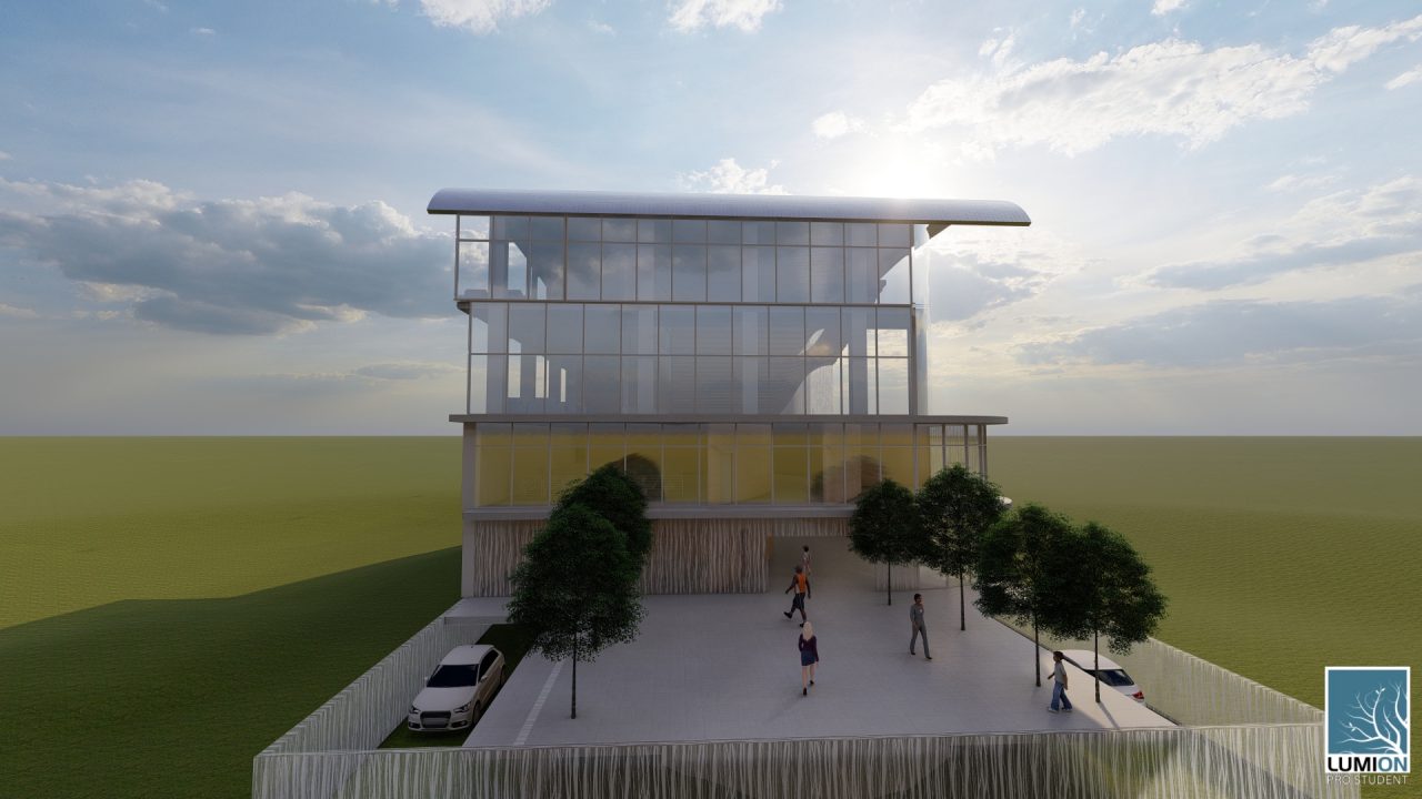
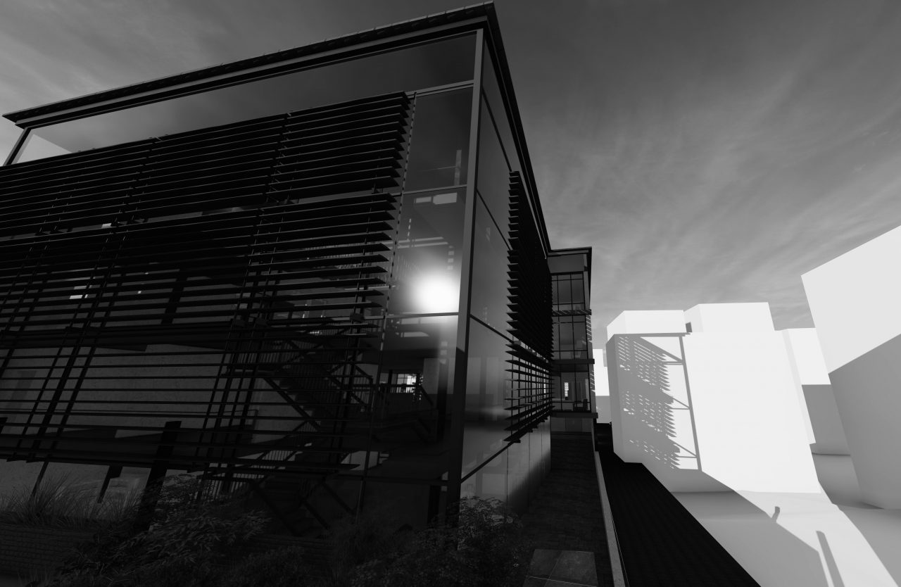
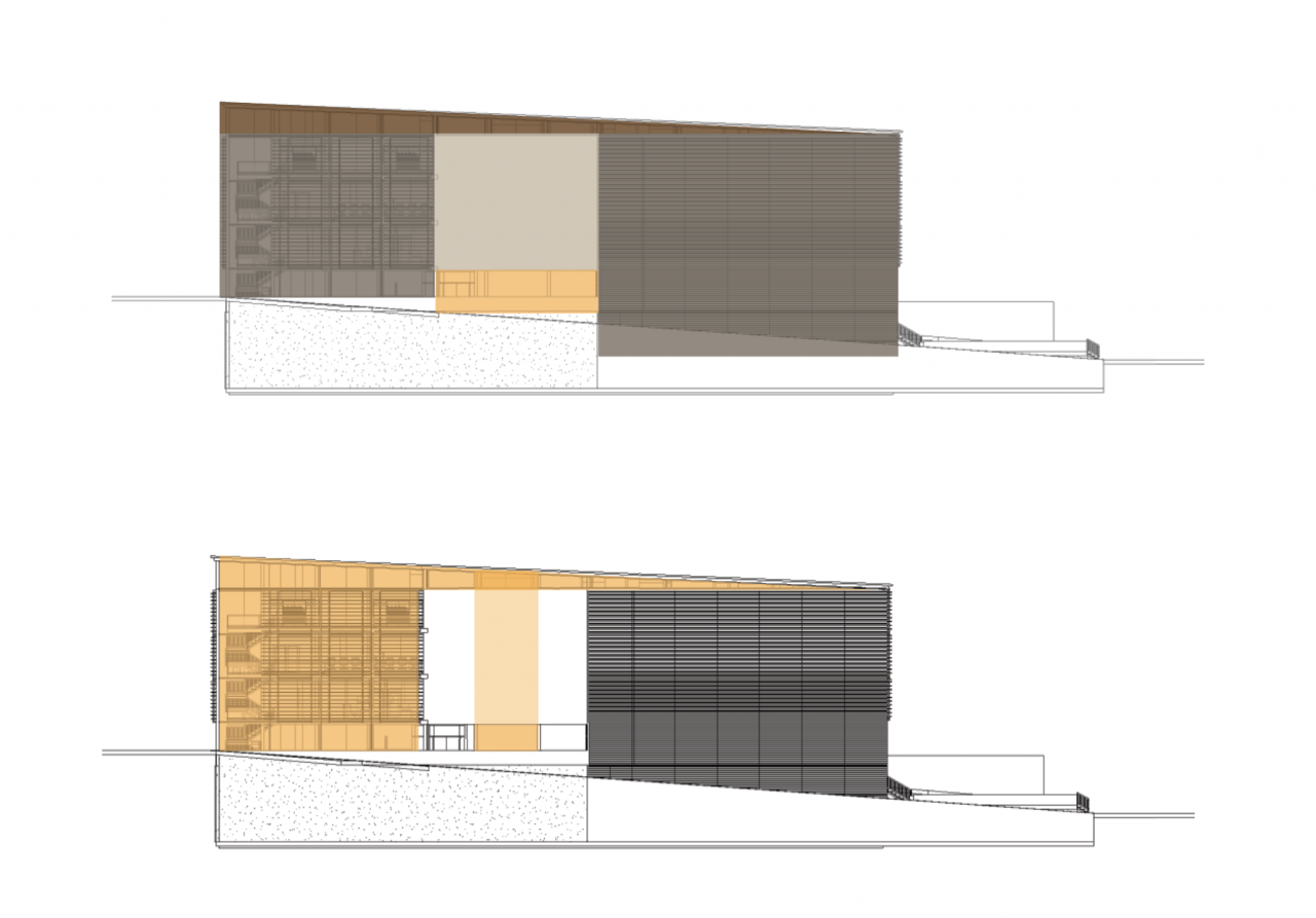
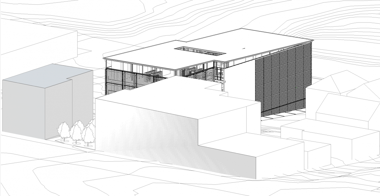
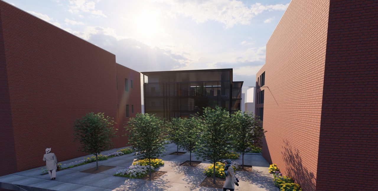
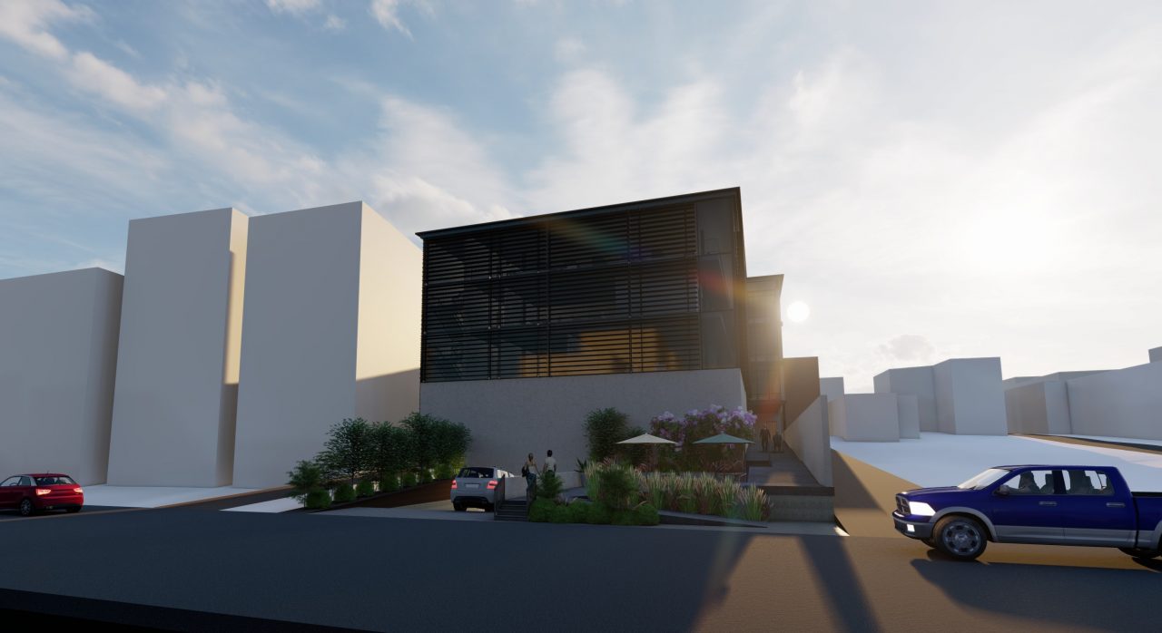
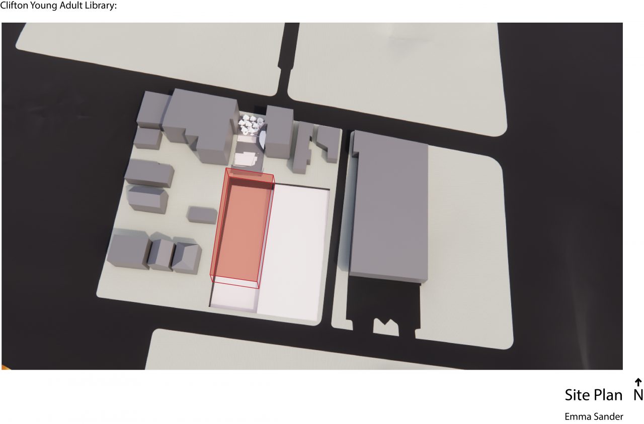
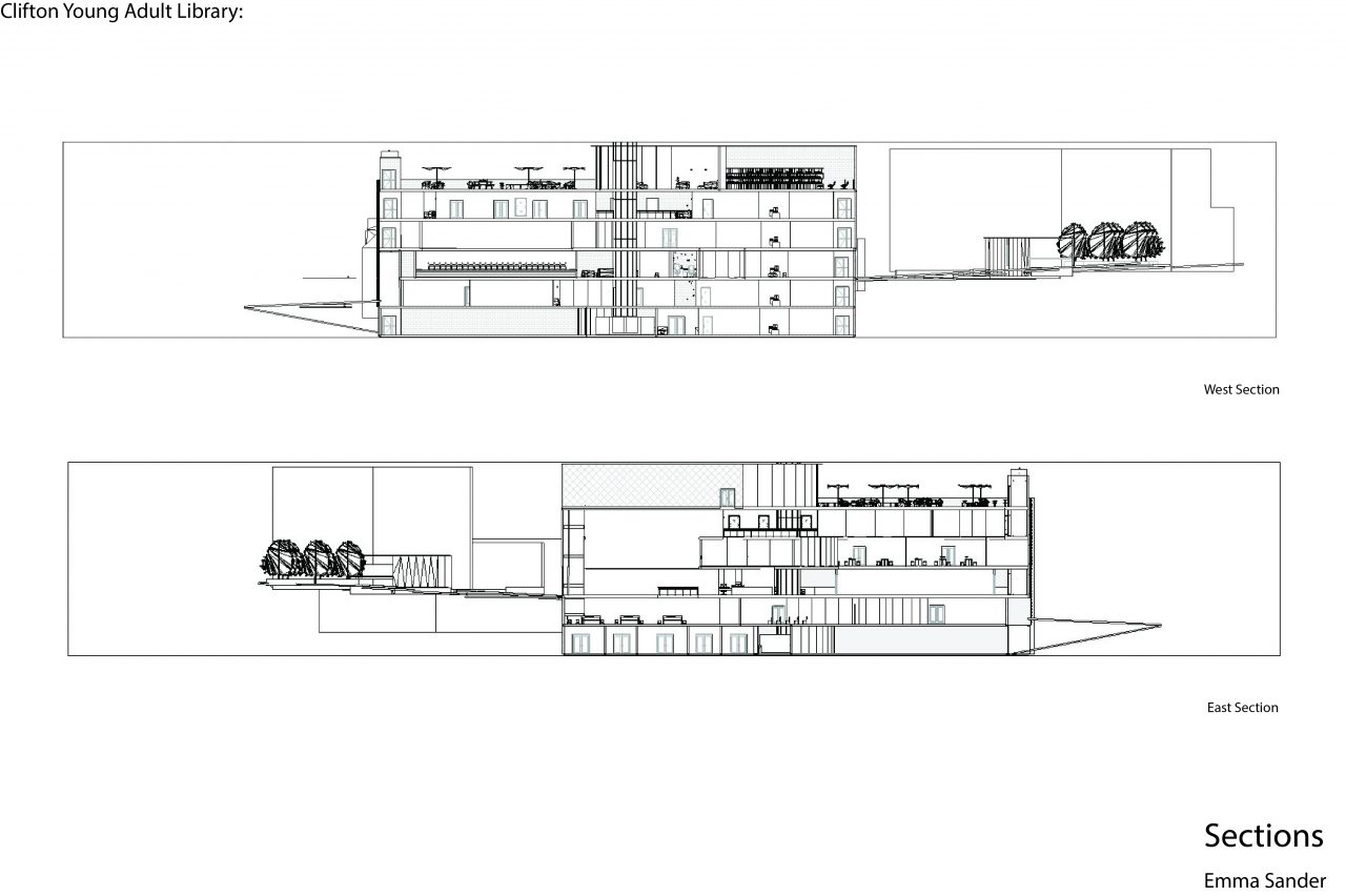
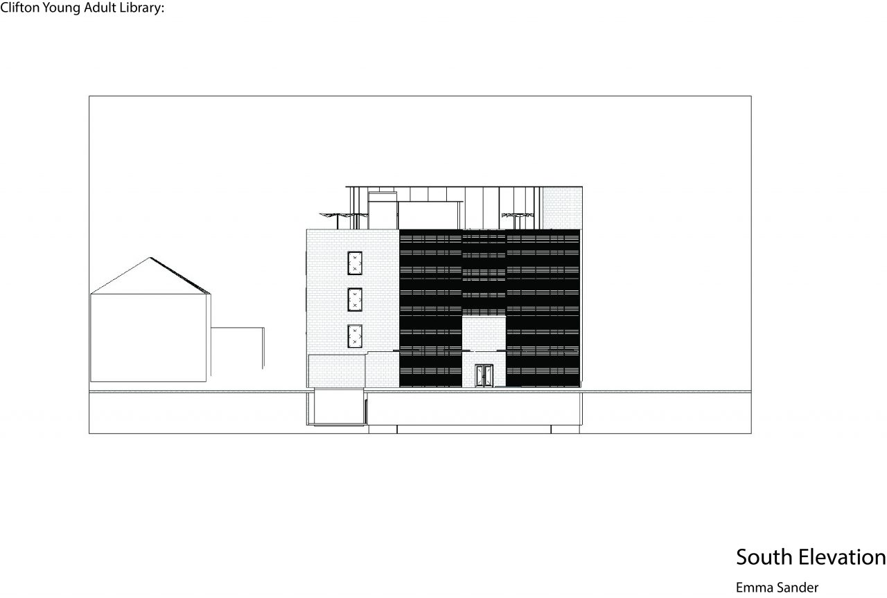
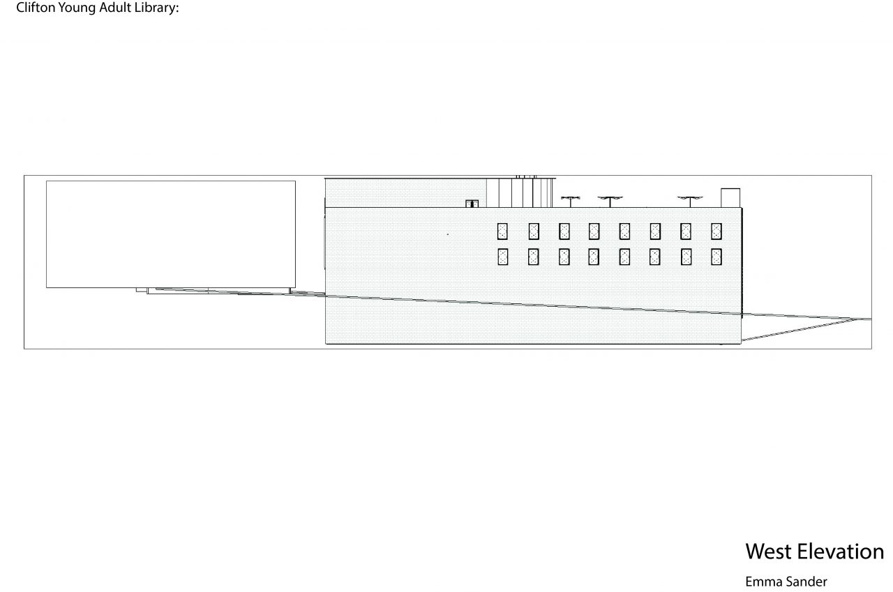
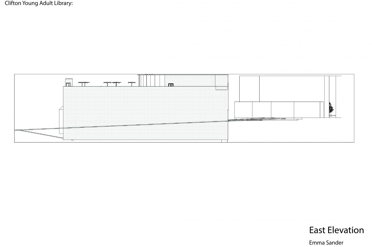
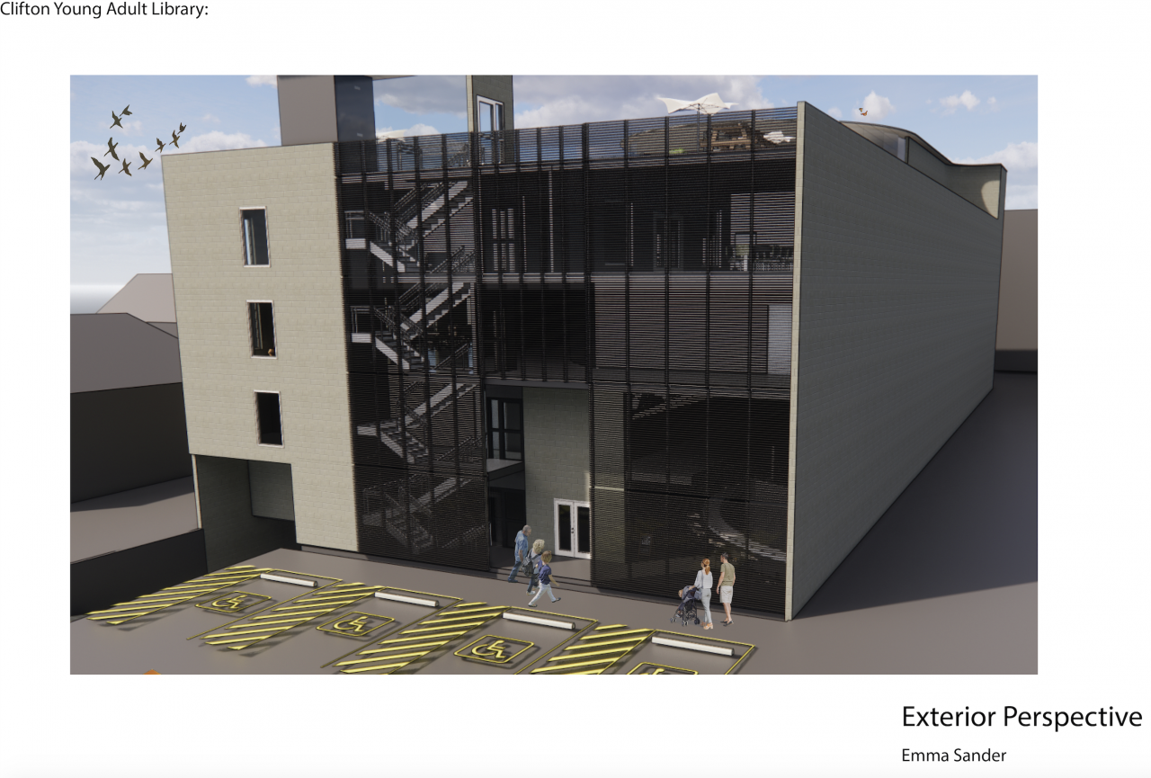
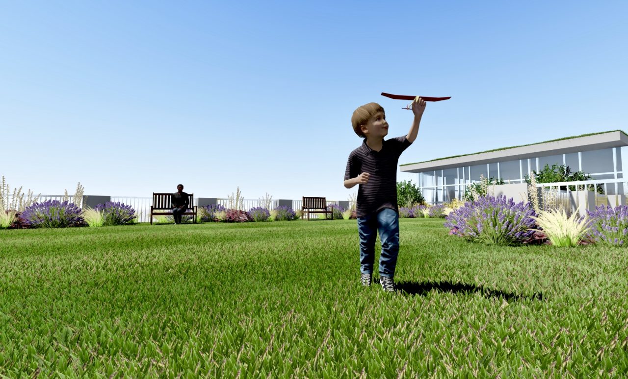
When approaching this project, I began by considering how the design could connect Clifton Plaza with Howell Street. In order to create a fluid path, I decided on the diagonally split form. The trapezoid shape of the two components reference my Clifton Plaza design. I wanted the plaza to flow into the library with the continuation of green space on the second level. The individual skylight components came out of the desire for each room to be comfortable and desirable for the inhabitants. The most public program elements are placed on the outside of the building and I tried to delineate each element in the East facade making them easier to identify from the outside.

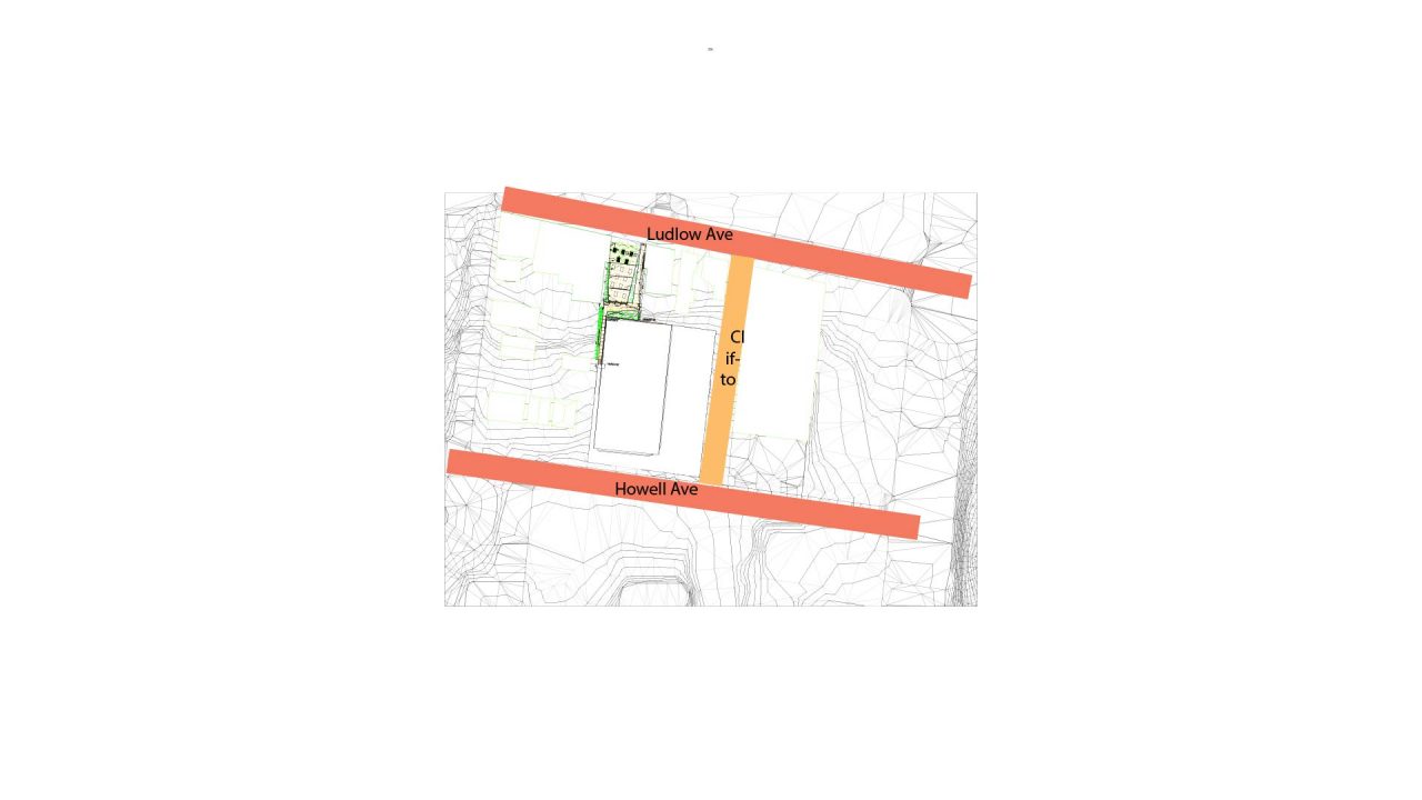
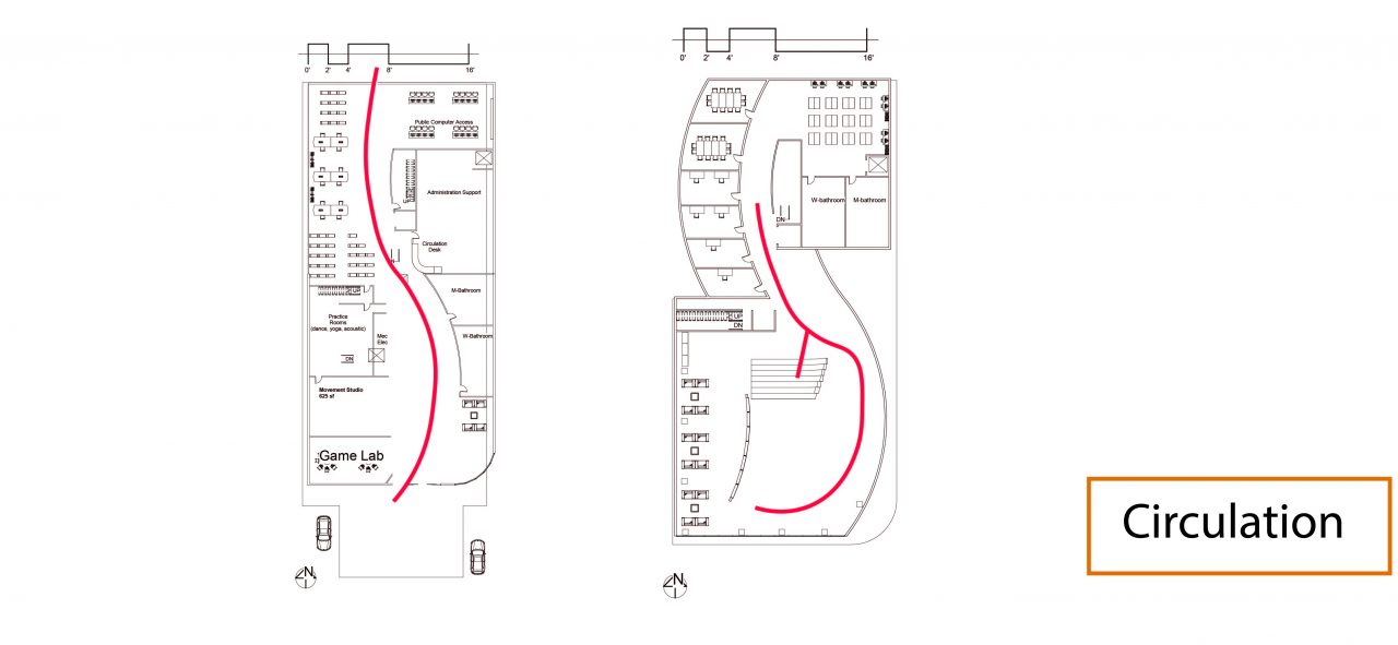




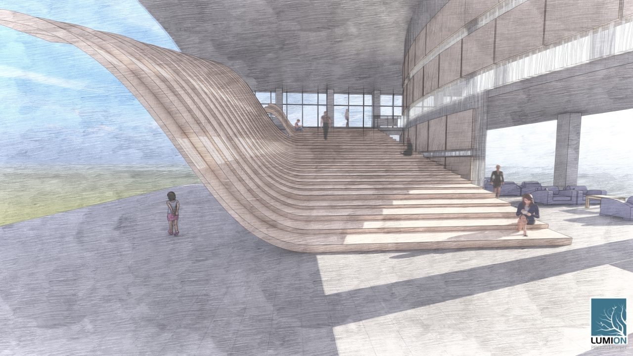


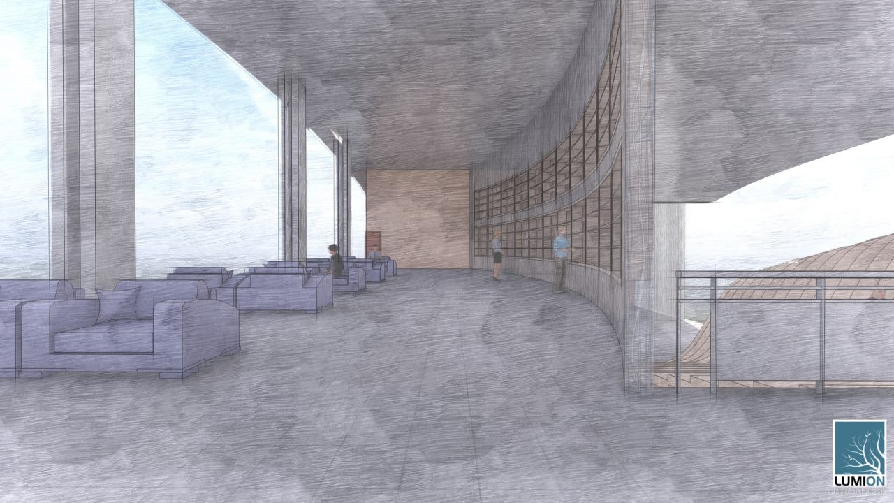
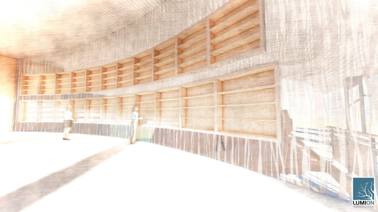
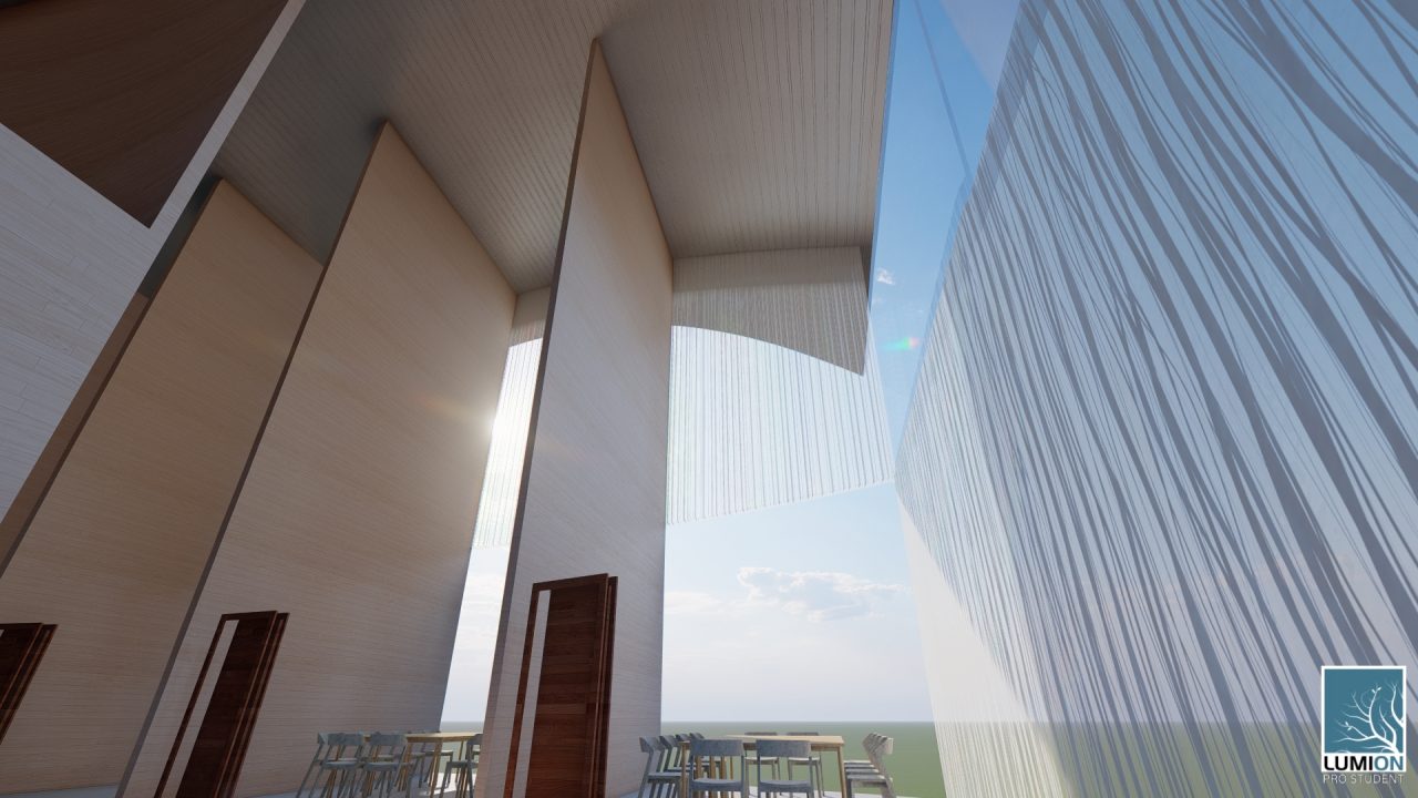


MOVEMENT ACROSS SITE + RELATIONSHIP TO SURROUNDINGS








Libraries have always been public spaces of learning, facilitating multiple forms of education, either oral or written knowledge. Going back to the earliest libraries in Athens and Alexandria, libraries have always been spaces that communities went to to join in debate, educated discussion and collaboration. Somewhere along the way, this idea has been lost. Libraries have shifted to individual learning, primarily focused on written knowledge and individual learning. Through the use of Neoclassical proportioning and borrowing from classic sequencing of space and axes this design aims to create a classical library for the modern age.
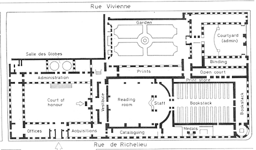
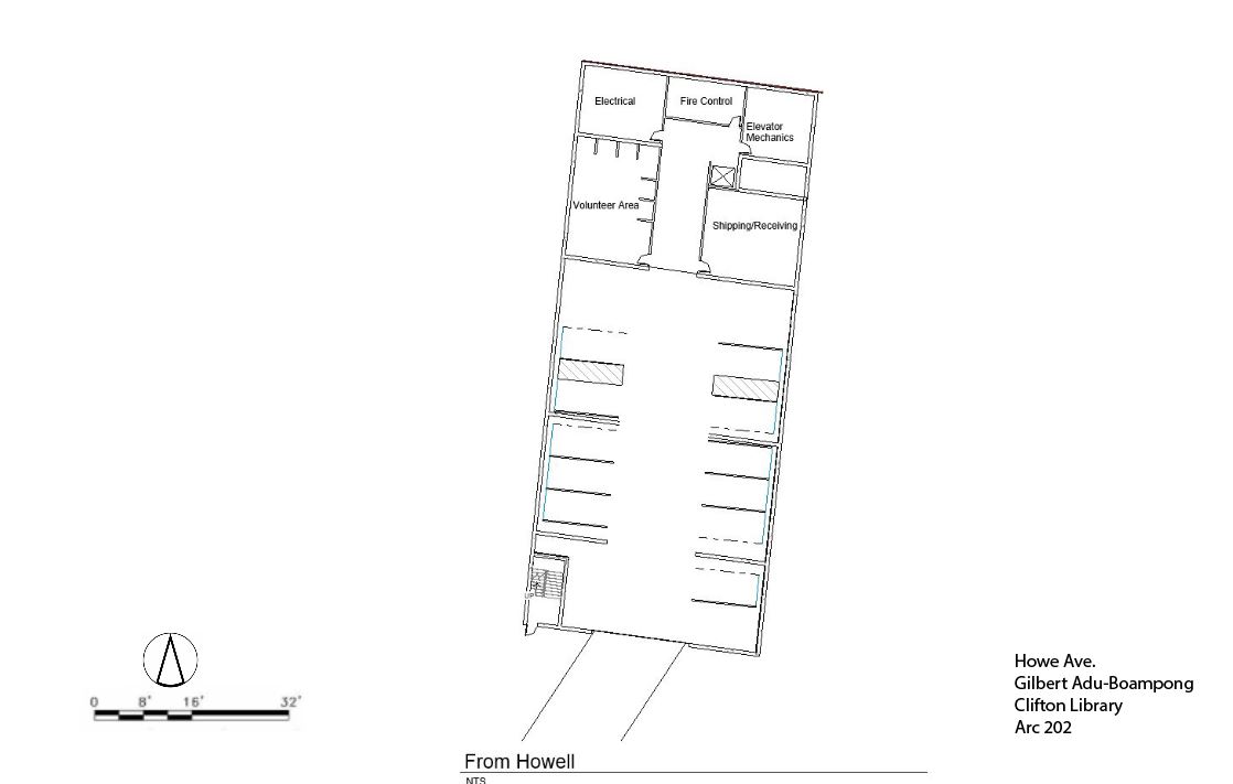
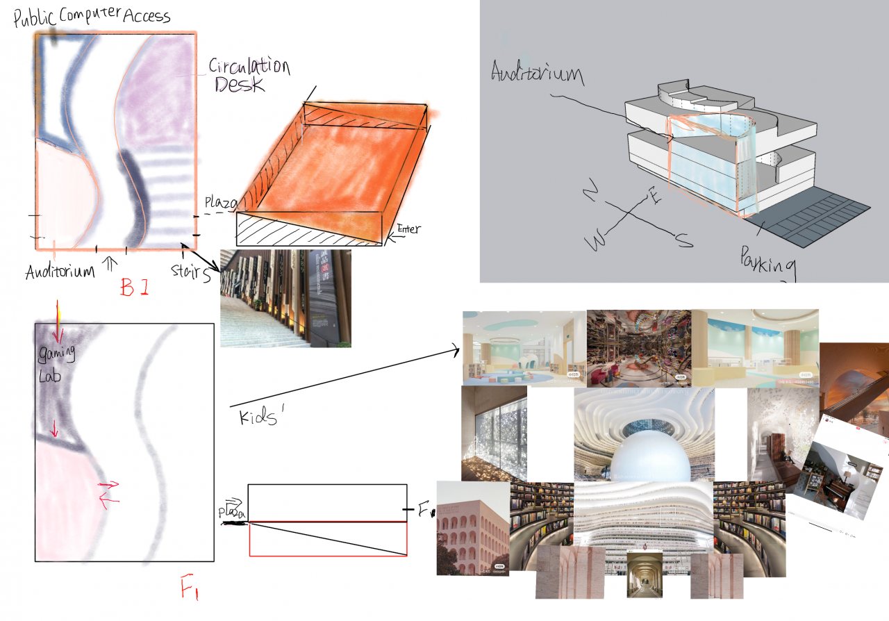
During the initial stages of the design process, I started by looking to famous library architect, Henri Labrouste. Borrowing from his Bibliotheque Nationale de France, in Paris, my design follows his classic sequences of space. In Labrouste’s Library, one enters through an open courtyard or green space flanked by administrative spaces, which then leads to a series of vestibules that open up to the different programatic spaces of the structure. However following the central axis of the space one would be lead into the large reading room, behind which would reside the majority of the book stacks accessible only by the staff. This design proposal for the Clifton Young Adult Library follows an abstracted version of this sequence with a focus on axes.
