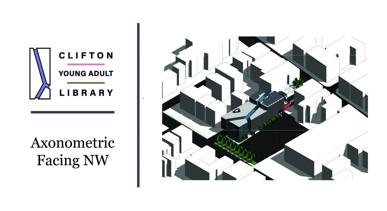
Axonometric Site Plan
Plans
Sections
Elevations
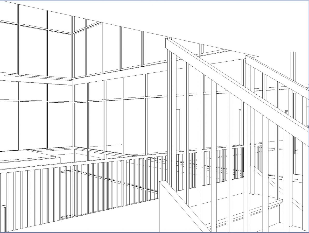
Perspectives
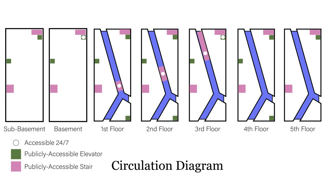
Circulation Diagram
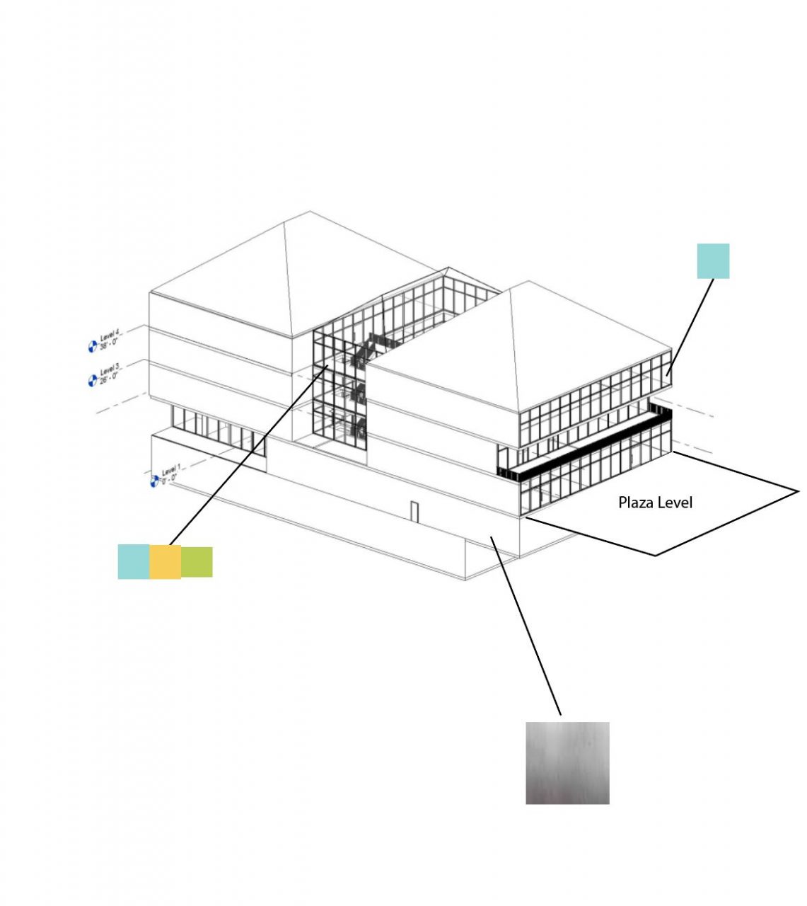
Materials


Design Studio || Spring 2020 || Second Year
A Miami University Blog
When beginning our research of various library’s, I used the Sawyer Library as a precedent for my space. This modernized library allows students to move freely throughout the space, utilizing each section. The 2014 edition features an atrium located on the center axis, prioritizing natural light.
The centerpiece parti diagram in the Sawyer Library serves as the driving design point for the entire library. This piece unifies both the new and old sections of the library as it moves the students through the entire space.
I was able to implement some of the design aspects seen in Sawyer Library and Bordeaux House, from my pocket park, into my own library. By intertwining three masses, the building begins to shape its own central backbone. Each mass overlaps creating a variety of dynamic levels, bringing the community together as one in the center of the library.
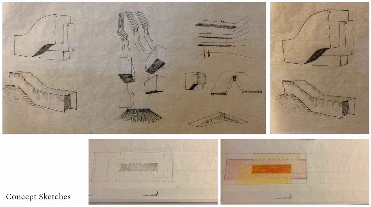
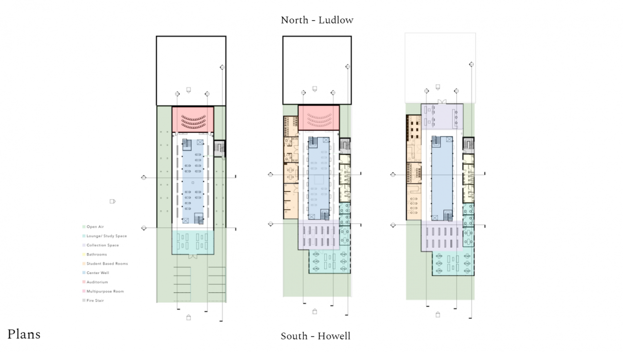
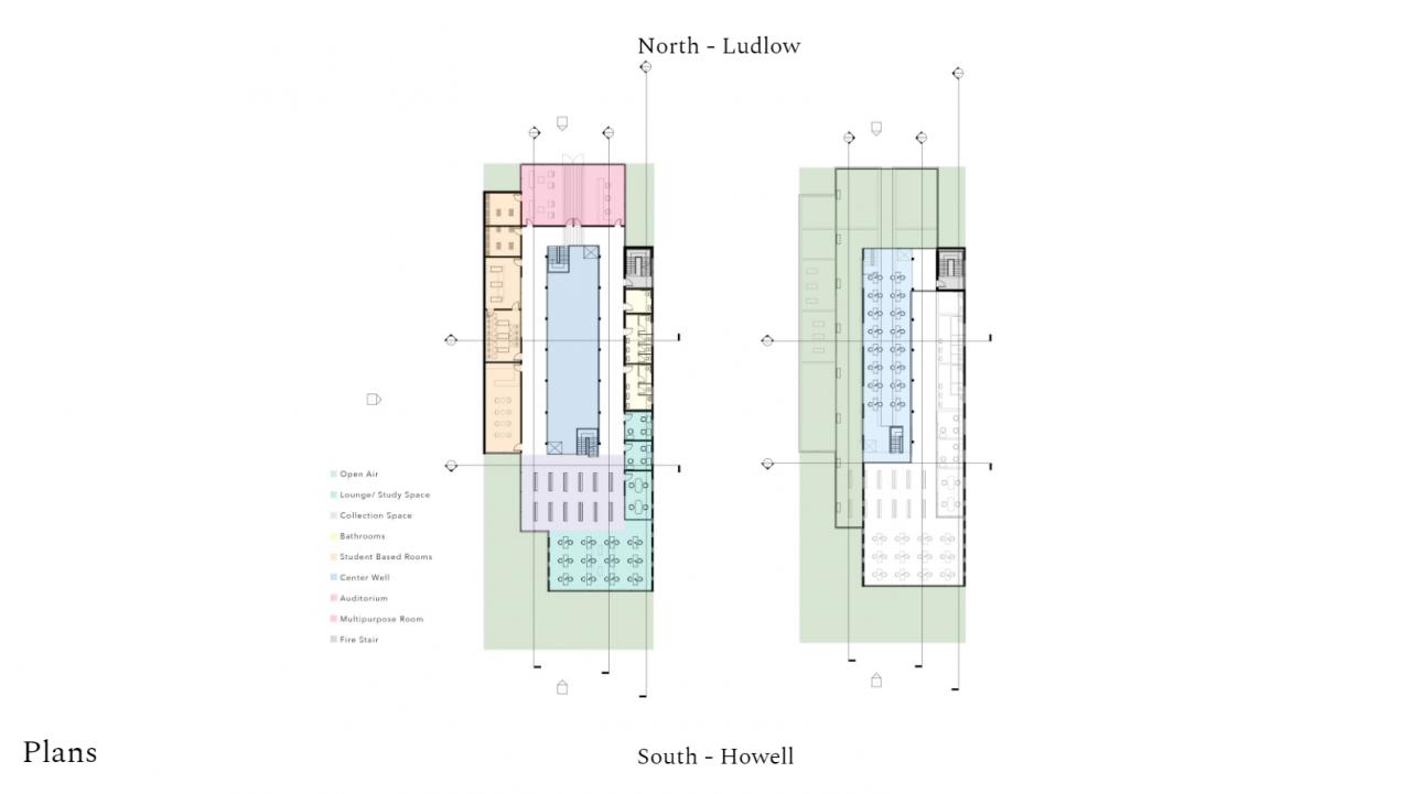
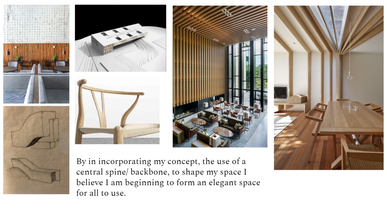
My Concept for this project is creating an experience that involves the way that light shines through the building. This is accomplished through the glass atrium that is in the center of the building, that will have different colored panels of glass. This will brings an indoor outdoor experience as one moves throughout the building.
